TL;DR
Мы все должны автоматизировать наш процесс сжатия изображений.
В 2017 году оптимизация изображений должна быть автоматизирована. Так просто забыть внести рекомендации и контент не проходящий через процесс сборки может легко проскочить. Для автоматизации: используйте imagemin или libvips для вашего процесса сборки. Существует много альтернатив.
Большинство CDN (например, Akamai) и сторонние решения, такие как Cloudinary, imgix, Fastly's Image Optimizer, Instart Logic's SmartVision или ImageOptim API предлагают полноценные автоматизированные решения для оптимизации изображений.
Количество времени, которое вы будете тратить на чтение сообщений в блоге и настройки конфигурации больше, чем ежемесячная плата за услуги (у Cloudinary есть бесплатный план). Если вы не хотите передавать эту работу на аутсорсинг по соображениям затрат или задержек, приведённые выше программы с открытым исходным кодом являются надёжными. Такие проекты как Imageflow или Thumbor можно развернуть у себя на хосте.
Все должны эффективно сжимать свои изображения.
Минимум: используйте ImageOptim. Он может значительно уменьшить размер изображений, сохраняя при этом качество. Windows и Linux альтернативы тоже есть.
Точнее: прогоняйте ваши JPEG'и через MozJPEG (q=80 или ниже отлично подходит для веб-контента) и рассматривайте поддержку Progressive JPEG'а, PNG через pngquant и SVG через SVGO. Однозначно удаляйте метаданные (--strip для pngquant), чтобы избежать раздутия. Вместо сумасшедше огромных анимированных GIF'ок, поставляйте H.264 видео (или WebM для Chrome, Firefox и Opera)! Если вы не можете, по крайней мере используйте Giflossy. Если вы можете сэкономить дополнительные циклы процессора, нуждаетесь в качестве большем чем в среднем по вебу и не против медленного времени кодирования: попробуйте Guetzli.
Некоторые браузеры заявляют о поддержке форматов изображения через заголовок запроса Accept. Он может использоваться для условной отправки форматов: например, формат с потерями WebP для браузеров на основе Blink, таких как Chrome, и фолбэк в виде JPEG/PNG для других браузеров.
Всегда можно сделать больше. Есть инструменты для создания и обслуживания атрибута srcset. Выбор ресурсов может быть автоматизирован в браузерах на основе Blink с client-hints и вы можете отправить меньшее количество байт для пользователей, которые выбрали "сохранение данных" в браузере, обратив внимание на Save-Data.
Чем меньше размер файла вы можете сделать для ваших изображений, тем лучше сетевой опыт вы можете предложить своим пользователям, особенно на мобильных устройствах. В этой записи мы рассмотрим способы уменьшения размера изображения с помощью современных методов сжатия с минимальным воздействием на качество.Содержание
display: none; ловушки
Введение
Изображения по-прежнему являются главной причиной раздутия веба.
На изображения приходится значительная часть пропускной способности интернета, потому что файлы изображений часто имеют большие размеры. Согласно HTTP Archive, 60% данных, передаваемых для загрузки веб-страницы, - это изображения в формате JPEG, PNG и GIF. По состоянию на июль 2017, изображения составили 1.7MB загруженного содержимого из 3.0MB среднего сайта.
Согласно Тэмми Эвартс(Tammy Everts), доказано, что добавление изображений на страницу или увеличение размера существующих изображений увеличивает конверсию. Маловероятно, что изображения исчезнут и поэтому инвестиции в эффективную стратегию сжатия для минимизации раздутия становятся важны.
Оптимизация изображений состоит из различных мер, помогающих уменьшить размер файла. В конечном счёте она зависит от требуемого качества изображения.
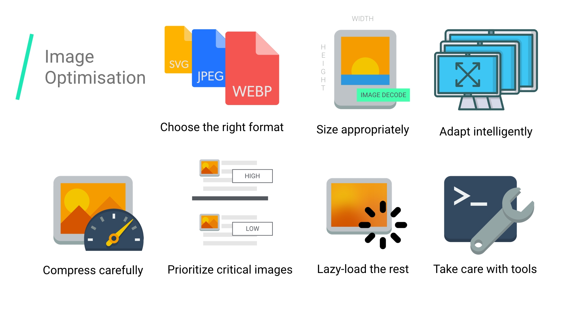
Распространённые способы оптимизации изображений включают сжатие, отзывчивую загрузку на основе размера экрана, используя <picture>/<img srcset>, и изменение размера для уменьшения стоимости декодирования изображений.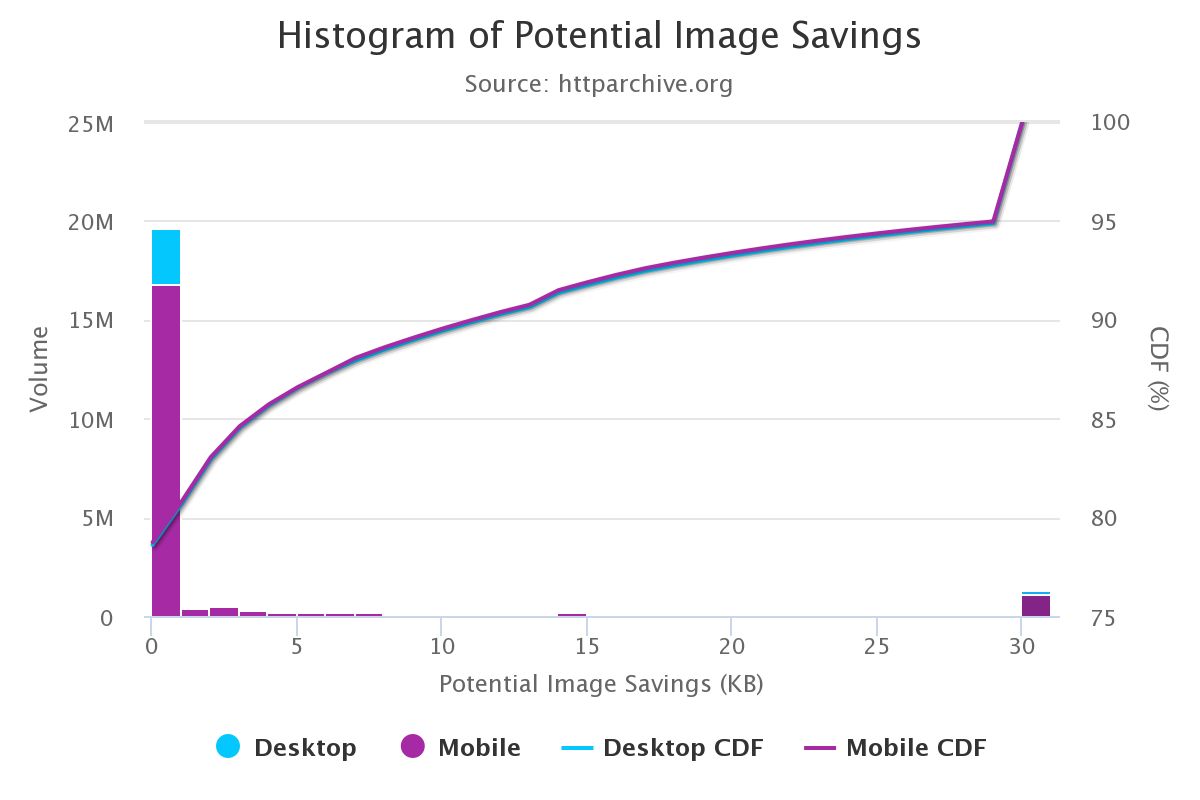
Большой простор, чтобы всем нам начать оптимизировать изображения лучше.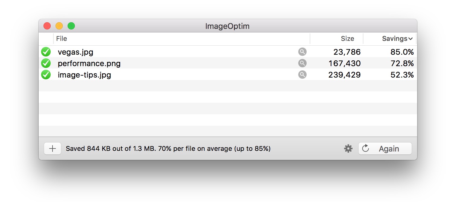
Если вы дизайнер, есть также плагин ImageOptim для Sketch, который будет оптимизировать ваши изображения при экспорте. Я считаю это большой экономией времени.
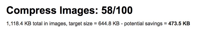
Как определить, нужно ли оптимизировать мои изображения?
Выполните аудит сайта с помощью WebPageTest.org и он покажет возможности для улучшения оптимизации ваших изображений (смотрите "Compress Images").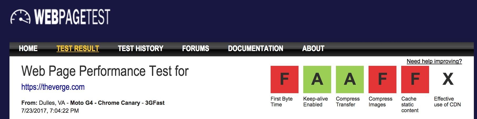
Lighthouse проверяет лучшие практики производительности. Он включает проверки для оптимизации изображений и может посоветовать изображения, которые могут быть сжаты сильнее или указать изображения, которые вне экрана и могут быть загружены позже.
После выхода Chrome 60, Lighthouse теперь находится в панели Audits в Chrome DevTools: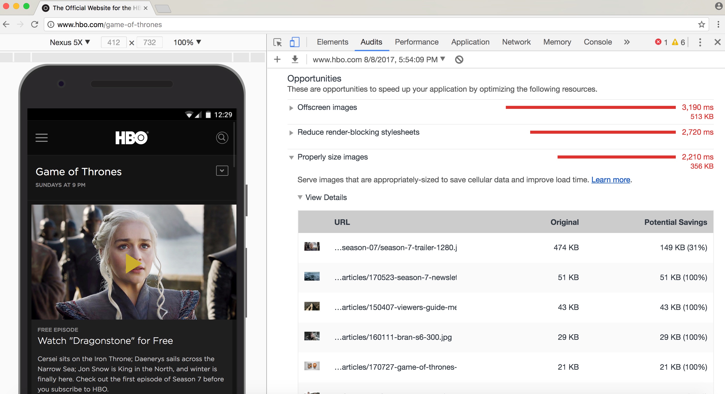
Вы также можете быть знакомы с другими инструментами аудита производительности, такими как PageSpeed Insights или Website Speed Test от Cloudinary, который включает подробный аудит анализа изображений.
Как выбрать формат изображения?
Как Илья Григорик(Ilya Grigorik) отмечает в своём превосходном руководстве по оптимизации изображений, «правильный формат» для изображения это сочетание желаемых визуальных результатов и функциональных требований. Вы работаете с растровыми или векторными изображениями?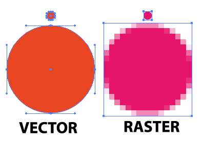
Растровая графика представляет изображения путём кодирования значений каждого пикселя в прямоугольной сетке пикселей. Они не являются независимыми от разрешения или зума. WebP или широко поддерживаемые форматы, такие как JPEG или PNG хорошо подходят для графики где необходим фотореализм. Guetzli, MozJPEG и другие идеи, о которых мы говорили, хорошо применимы к растровой графике.
Векторная графика использует точки, линии и полигоны для представления изображений и формат используется для простых геометрические фигур (например, логотипов), SVG лучше всего подходит, когда нужно высокое разрешение и масштабирование.
Не тот формат может стоить вам. Логический выбор правильного формата может быть рискован, поэтому экспериментировать с форматами лучше с осторожностью.
Джереми Вагнер(Jeremy Wagner) рассказал про компромиссы, которые стоит учитывать при оценке форматов, в его презентации об оптимизации изображений.
Скромный JPEG.
JPEG может быть самым широко используемым форматом изображений в мире. Как отмечалось ранее, 45% изображений отображаемых на сайтах собранных HTTP Archive это JPEG'и. Ваш телефон, ваш цифровой фотоаппарат, даже старая веб-камера - всё в значительной степени поддерживает этот кодек. Также он очень старый, вернёмся в 1992 год, когда он был впервые выпущен. В это время, было сделано огромное количество исследований, пытаясь улучшить то, что он предлагает.
JPEG-это алгоритм сжатия с потерями, который отбрасывает информацию для экономии места и многих усилий, которые были предприняты после того, как он попытался сохранить визуальную точность, сохраняя при этом размеры файлов как можно меньше.
Какое качество изображения приемлемо в вашем случае?
Форматы, такие как JPEG, лучше всего подходят для фотографий или изображений с несколькими цветовыми областями. Большинство инструментов оптимизации позволит вам установить, каким уровнем сжатия вы довольны; более высокое сжатие уменьшает размер файла, но может привести к артефактам, гало или блочной деградации.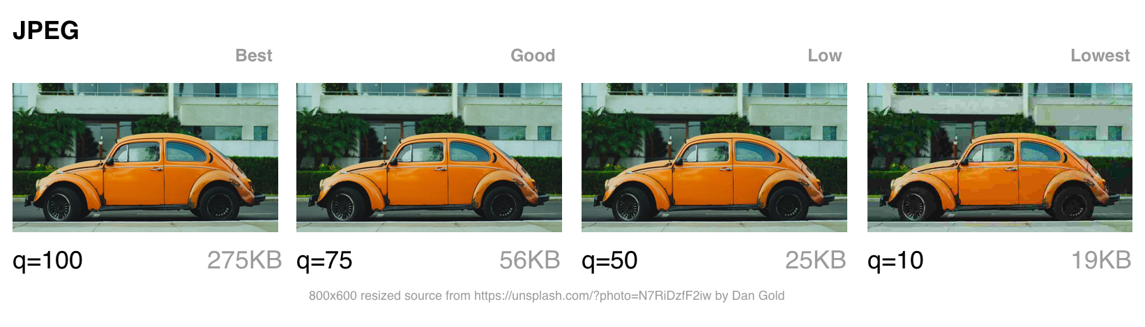
При выборе какое качество настроить, надо учитывать в какую категорию попадает ваше изображение:
- Лучшее качество - когда качество имеет значение больше, чем пропускная способность. Оно может быть, потому что изображение имеет высокое значение в дизайне или отображается в полном разрешении.
- Хорошее качество - когда вы заботитесь о доставке небольшого размера файлов, но не хотите слишком сильно негативно влиять на качество изображения. Пользователи по-прежнему беспокоятся о каком-то уровне качества изображения.
- Низкое качество - когда вы заботитесь о пропускной способности и ухудшение изображения вам подходит. Эти изображения подходят для неоднородных/плохих условий сети.
- Низкое качество - экономия пропускной способности имеет первостепенное значение. Пользователи хотят качественного взаимодействия, но будут согласны на заниженное качество для более быстрой загрузки страниц.
Далее поговорим о режимах сжатия JPEG, так как они могут сильно влиять на производительность.
Режимы сжатия JPEG
У формата изображений JPEG есть множество различных режимов сжатия. Три наиболее популярных - это базовый режим сжатия или последовательный JPEG (baseline, он же sequential), Прогрессивный режим сжатия JPEG (прогрессивный JPEG или PJPEG, он же формат с чересстрочной разверткой) и JPEG со сжатием без потерь.
Прим. пер.: В дальнейшем слова «режим сжатия» будут опущены, но будут иметься ввиду. Помните, что подразумеваются не какие-то разновидности формата JPEG, а различные режимы (или алгоритмы) обработки содержимого файла. То есть вместо «базовый режим сжатия JPEG», будет «базовый JPEG».
Чем отличаются базовый (или последовательный) JPEG и прогрессивный JPEG?
Базовый JPEG (режим по умолчанию в большинстве графических редакторов и инструментов для оптимизации изображений) кодируется и декодируется в относительно простом порядке: сверху вниз. Когда базовый JPEG загружается при медленном или нестабильном соединении, пользователи видят верхнюю часть изображения, которая увеличивается по мере загрузки. JPEG со сжатием без потерь очень похож на базовый, но у него устанавливается меньший коэффициент сжатия.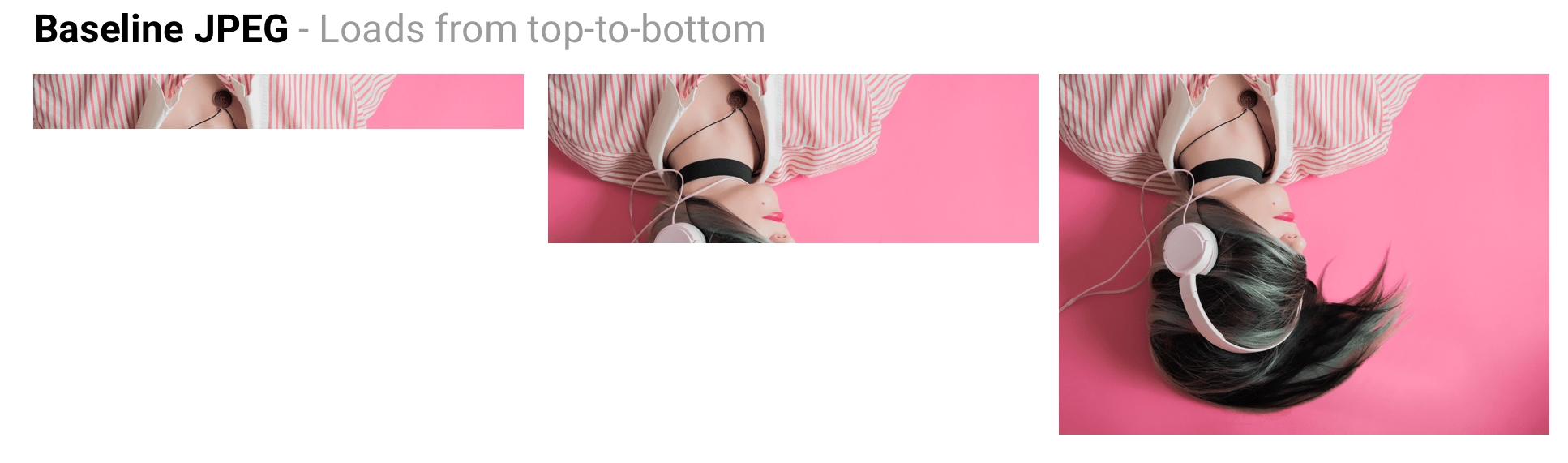
Прогрессивный JPEG делит изображение на несколько слоёв (scans). Первый слой показывает изображение размытым или с настройками очень низкого качества, а каждые последующие слои улучшают качество изображения. Думайте об этом как о прогрессивном уточнении. У каждого слоя изображения более высокий уровень детализации и, когда они соединяются вместе, получается изображение исходного качества.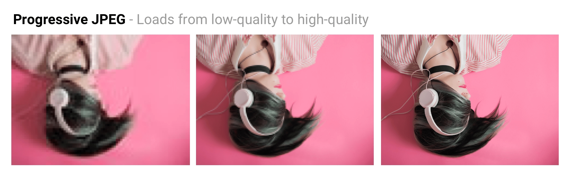
JPEG со сжатием без потерь может быть достигнут путём удаления данных EXIF, добавленных цифровыми камерами или графическими редакторами, оптимизацией таблиц Хаффмана в изображении или повторным сканированием изображения. Такие инструменты как jpegtran позволяют добиться сжатия без потерь за счёт перераспределения сжатых данных, не ухудшая при этом качества изображения. jpegrescan, jpegoptim и mozjpeg (которые мы вскоре рассмотрим) также поддерживают JPEG со сжатием без потерь.
Преимущества прогрессивного JPEG
Способность прогрессивного JPEG показывать «приблизительный предварительный просмотр» изображения при загрузке повышает воспринимаемую производительность: пользователи могут чувствовать, что изображение быстрее загружается по сравнению с адаптивными изображениями. Прим. пер.: Скорее всего имеется ввиду сравнение с базовым JPEG.
При медленном соединении, например 3G, это позволяет пользователю видеть что (примерно) изображено на картинке пока загружена только часть файла и даёт возможность принять решение: ждать его полной загрузки или нет. Это может быть удобнее (и приятнее), чем отображение картинок сверху вниз в случае базового JPEG.
Прогрессивный JPEG может улучшить сжатие, требуя на 2-10% меньше данных по сравнению с базовым/простым JPEG для изображений более 10KB. Более высокое качество сжатия достигается за счёт того, что каждый слой в JPEG изображении может иметь свою собственную выделенную таблицу Хаффмана. Современные JPEG кодеки (такие как libjpeg-turbo, MozJPEG и так далее) используют преимущества прогрессивного JPEG для лучшей упаковки данных.
Кто использует прогрессивный JPEG в продакшен?
- Twitter.com переключился на использование прогрессивного JPEG с уровнем качества (baseline of quality) 85%. Они измеряли задержку восприятия пользователя (время до первого отображения и общее время загрузки) и пришли к выводу, что прогрессивный JPEG был хорошим выбором с учётом их требований относительно небольшого размера файлов, приемлемого времени кодирования и декодирования.
- Facebook переключился на использование прогрессивного JPEG в приложении для iOS. Они заметили, что это уменьшает объём используемых данных на 15% и позволил им показывать изображение в хорошем качестве на 15% быстрее.
- Yelp переключился на использование прогрессивного JPEG и обнаружил, что отчасти с этим связана экономия объёма хранения изображений примерно на 4.5%. Также они дополнительно сэкономили примерно 13.8% за счёт применения MozJPEG.
Множество других сайтов с большим количеством тяжёлых изображений, такие как Pinterest, также применяют прогрессивный JPEG в продакшен окружении.
Недостатки прогрессивного JPEG
Прогрессивный JPEG может кодироваться медленнее, чем базовый JPEG - иногда в 3 раза дольше. На настольных компьютерах с мощными процессорами это может быть менее затратно, чем на слабых мобильных устройствах с ограниченными ресурсами. Отображение неполных слоёв требует работы, поскольку вы в основном декодируете изображение несколько раз. Эти множественные проходы могут потреблять ресурсы процессора.
Файл JPEG с прогрессивным сжатием также не всегда обладает наименьшим размером. Для очень маленьких изображений (например для миниатюр, иконок) прогрессивный JPEG может быть больше, чем вариант с базовым сжатием. Скорее всего для таких небольших изображений прогрессивное сжатие может не подходить.
Это означает, что при принятии решения о внедрении прогрессивного JPEG вам необходимо провести эксперимент и найти правильный баланс размера файла, задержки в сети и потреблении ресурсов процессора.
Примечание: PJPEG (как и все файлы JPEG) на мобильных устройствах иногда могут обрабатываться аппаратными средствами. Но не у всех Android устройств есть подобные средства, чаще всего они встречаются на дорогих устройствах и устройствах на базе iOS. То есть подобные изображения могут не снизить потребление оперативной памяти увеличив производительность, а наоборот, негативно повлиять на загрузку ЦП и скорость отрисовки в целом.
Некоторые пользователи могут считать, что прогрессивная загрузка является недостатком, так как может быть трудно определить, когда изображение загрузилось полностью. Поскольку это может сильно различаться для каждой аудитории, оцените, что имеет смысл для вашей аудитории.
Как создать прогрессивный JPEG?
Инструменты и библиотеки, такие как ImageMagick, libjpeg, jpegtran, jpeg-recompress и imagemin позволяют экспортировать прогрессивный JPEG. Если у вас уже есть существующий процесс оптимизации изображений, скорее всего, что добавление поддержки прогрессивной загрузки может быть достаточно простым:
const gulp = require('gulp');
const imagemin = require('gulp-imagemin');

gulp.task('images', function () {
    return gulp.src('images/*.jpg')
        .pipe(imagemin({
            progressive: true
        }))
        .pipe(gulp.dest('dist'));
});
Большинство инструментов для редактирования изображений по умолчанию сохраняют изображения JPEG с базовым режимом сжатия.
Цветовая субдискретизация
Наши глаза больше склонны к потере деталей цвета в изображении (цветности), чем яркости (luminance или luma, яркость как мера светлоты). Цветовая субдискретизация (или Chroma subsampling) представляет собой вид сжатия, который снижает точность воспроизведения цвета в сигнале в пользу яркости. Это уменьшает размер файла, в некоторых случаях до 15-17%, без отрицательного влияния на качество изображения и может быть использовано в JPEG изображениях. Субдискретизация также может уменьшить потребление памяти изображениями.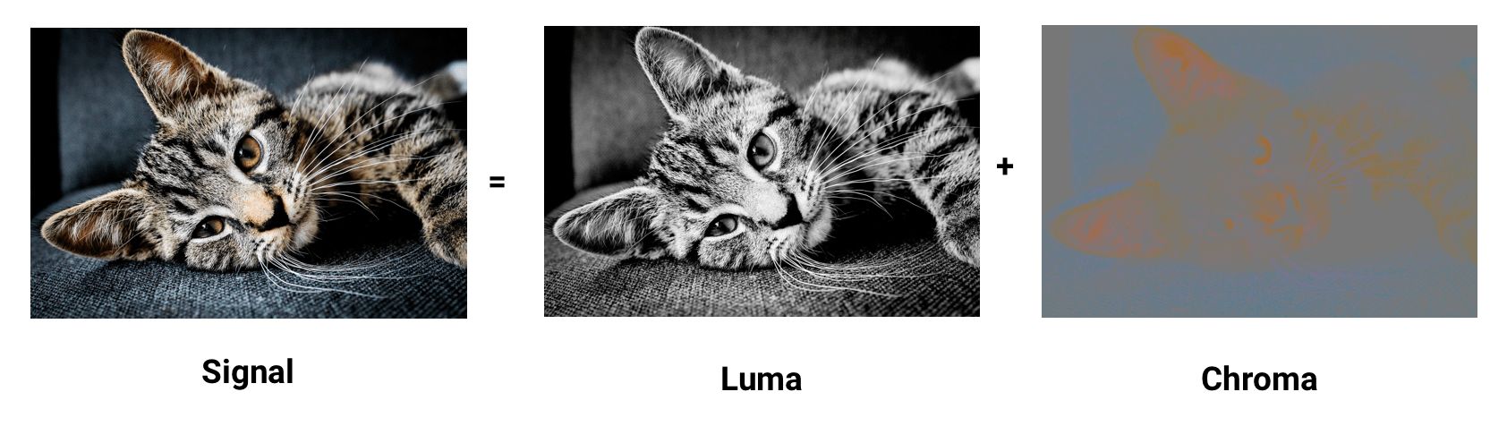
Контраст образующий формы, которые мы видим на изображении, определяется в первую очередь яркостью. Например, старые или отфильтрованные черно-белые фотографии могут не содержать цвета, но благодаря яркости они могут быть столь же подробными, как и их цветовые контрасты. Цветность (цвет) оказывает меньшее влияние на зрительное восприятие.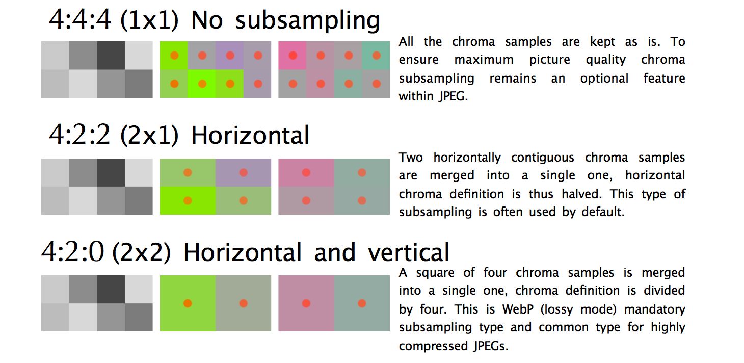
Вот несколько общих примеров, обсуждаемых при разговоре о субдискретизации. Обычно говорят 4: 4: 4,4: 2: 2 и 4: 2: 0. Но что они означают? Предположим, что субдискретизации принимает формат A: B: C. A - количество пикселей в строке, для JPEG - это обычно 4. B представляет количество цветов в первой строке, а C - цвет во второй.
4:4:4не имеет сжатия, поэтому цвет и яркость передаются без преобразований.4:2:2дискретизация на половину горизонтальной строки, при этом преобразований по вертикали не происходит.4:2:0дискретизация на половину горизонтальной строки, при этом содержимое второй строки игнорируется. (прим. перев. В последней картинке указано что дискретизация происходит на основании первой половины первой и второй строк, т.е. одной половины блока из 8 пикселей)
Уменьшая количество пикселей в цветовой составляющей изображения, можно значительно уменьшить размер составляющих цвета, и в конечном счёте уменьшить размер файла в байтах.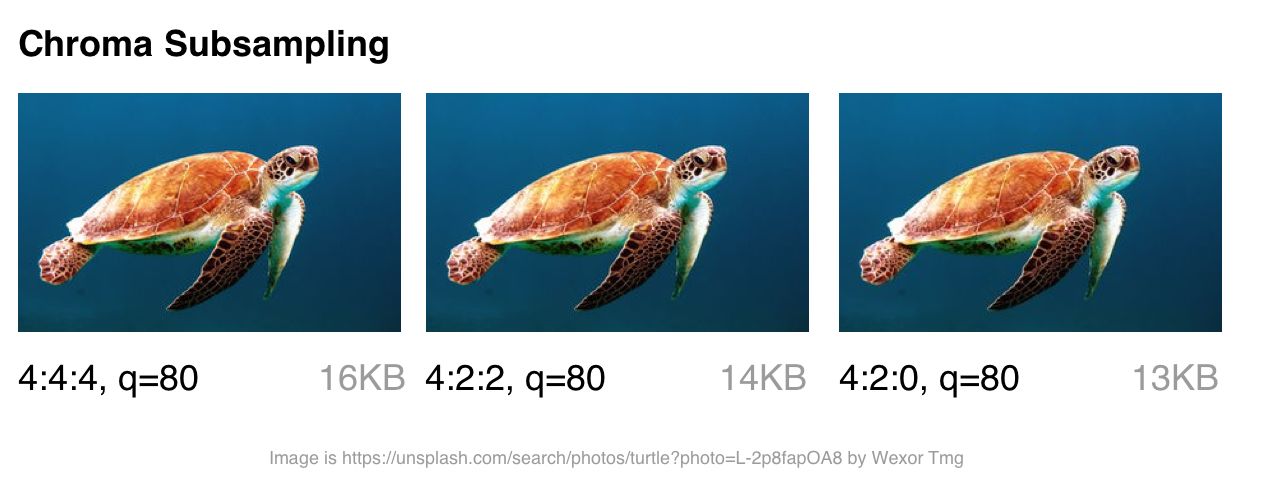
Цветовую субдискретизацию стоит рассматривать для большинства типов изображений. Но у этого способа сжатия есть некоторые важные исключения: поскольку подвыборка зависит от того как цвет воспринимается нашими глазами, данный способ не очень подходит для сжатия изображений, где детали цвета могут быть столь же важны, как яркость (например, медицинские изображения).
Изображения, содержащие шрифты, также могут пострадать, поскольку плохое сжатие текста может уменьшить его разборчивость. Более контрастные переходы цвета сложнее сжимать с помощью JPEG, поскольку он был разработан для лучшей обработки фотографических сцен с более мягкими переходами.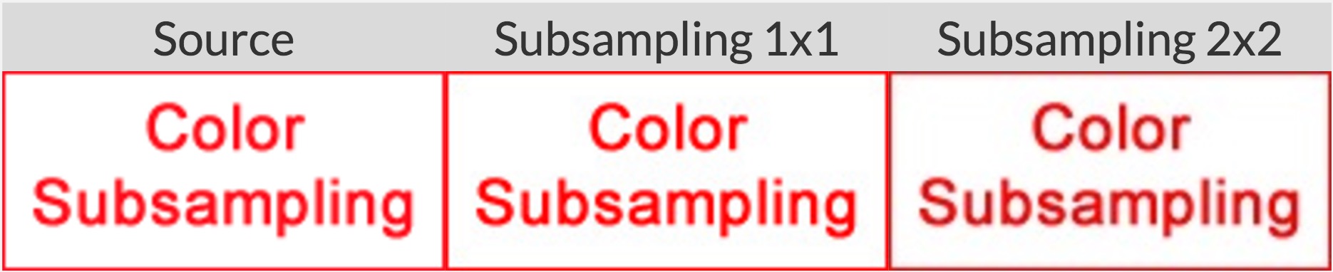
Общая информация: Точный метод цветовой субдискретизации в спецификации JPEG указан не был, поэтому разные декодеры обрабатывают его по-разному. MozJPEG и libjpeg-turbo используют один и тот же метод обработки. В старых версиях libjpeg используется другой метод, который добавляет кольцевые артефакты (ringing artifacts) в цветах.
Для дополнительной информации о цветовой субдискретизации, см. Why aren’t your images using Chroma subsampling?.
Как далеко мы ушли от JPEG?
Ниже представлены современные форматы изображений в Интернете:
tl;dr - большая фрагментация. Нам часто приходится готовить разные форматы изображений для разных браузеров, чтобы иметь возможность использовать что-либо современное.
- JPEG 2000 (2000) - улучшенный JPEG основанный на отказе от преобразования на основе дискретного косинуса в пользу метода, основанного на вейвлетах. Поддержка браузерами Safari desktop + iOS
- JPEG XR (2009) - альтернатива JPEG и JPEG 2000 с поддержкой HDR и широким охватом (англ. gamut) цветовых пространств. Производит файлы меньшего размера, чем JPEG, при немного меньшей скорости кодирования/декодирования. Поддержка браузерами Edge, IE.
- WebP (2010) - формат от Google, основанный на блочном прогнозе (block-prediction), с поддержкой сжатия с потерями и без потерь. Оптимизация обычных изображений похожа на JPEG, а изображений с прозрачностью на PNG. Отсутствует настройка цветовой субдискретизации и прогрессивная загрузка. Время декодирования также медленнее, чем декодирование JPEG. Поддержка браузерами Chrome, Opera. Экспериментальная поддержка в Safari и Firefox.
- FLIF (2015) - свободный формат сжатия изображений без потери качества, который по степени сжатия превосходит PNG, WebP без сжатия, BPG без сжатия и JPEG 2000 без сжатия. Поддержки браузерами нет Обратите внимание, что есть браузерный JS декодер.
- HEIF и BPG. С точки зрения сжатия они одинаковы, но у каждого свой контейнер (wrapper):
- BPG (2015) - предназначенная для более эффективной с точки зрения сжатия замены JPEG'у, на основе HEVC (High Efficiency Video Coding). Позиционируется, как формат, способный предложить лучший размер файла по сравнению с MozJPEG и WebP. Что маловероятно из-за проблем с лицензированием. Поддержки браузерами нет. Обратите внимание, что есть браузерный JS декодер.
- HEIF (2015) - формат изображений и последовательностей изображений для хранения изображений, кодированных HEVC, с применением ограниченного межкадрового предсказания (в ориг. inter-prediction). Apple объявила на WWDC, что они будут изучать переключение на HEIF через JPEG для iOS, ссылаясь на 2x кратную экономию на размере файла. Поддержки браузерами во время написания книги нет. Со временем в Safari desktop and iOS 11
Для более наглядного сравнения вы можете обратиться к этому или этому сравнению, перечисленных выше форматов.
Таким образом, поддержка браузера фрагментирована, и если вы хотите воспользоваться преимуществами любого из вышеперечисленных форматов, вам, скорее всего, придётся делать копии изображения разных типов для каждого из ваших целевых браузеров. Мы в Google увидели некоторые преимущества в WebP, поэтому в ближайшее время мы займемся им более плотно.
Вы также можете использовать форматы изображений (например, WebP, JPEG 2000) с расширением .jpg (или любым другим), поскольку браузер может отображать изображение, выбирая при этом тип содержимого (media type). Это позволяет согласовать тип содержимого (content-type negotiation) на стороне сервера, чтобы решить, какое изображение отправить, без необходимости правки HTML. Такие сервисы, как Instart Logic, используют этот подход при доставке изображений своим клиентам.
А сейчас, давайте поговорим о том случае, когда вы не можете готовить разные форматы изображений для разных браузеров, об оптимизации кодировщиков JPEG.
Оптимизация кодировщиков JPEG
Современные кодировщики JPEG пытаются создавать более мелкие файлы с высоким качеством воспроизведения, поддерживая совместимость с существующими браузерами и приложениями для обработки изображений. Они избегают необходимости вводить новые форматы изображений или изменения в экосистеме, чтобы повысить эффективность сжатия. Два таких кодировщика - MozJPEG и Guetzli.
tl;dr Какой оптимизирующий кодировщик JPEG вы должны использовать?
- Большинство задач: MozJPEG
- Качество - это ваша главная проблема, и вы не возражаете против долгого времени кодирования: используйте Guetzli
- Если вам нужна возможность настройки:
- JPEGRecompress (который под капотом использует MozJPEG)
- JPEGMini. Он похож на Guetzli - автоматически выбирает лучшее качество. Он не настолько сложен, как Guetzli, но он быстрее и нацелен на качество сжатия, более подходящее для Интернета.
- ImageOptim API (с бесплатным онлайн интерфейсом) - он уникален в обработке цвета. Вы можете выбрать качество цвета отдельно от общего качества. Он автоматически выбирает уровень цветовой субдискретизации для сохранения цветов с высоким разрешением в скриншотах, но избегает ненужных байтов на плавных переходах цветах на естественных фотографиях.
Что такое MozJPEG?
Mozilla предлагает модернизированный кодировщик JPEG под названием MozJPEG. Утверждается, что сжатие эффективнее до 10% от обычного сжатия в JPEG. Файлы, сжатые с помощью MozJPEG, работают кроссбраузерно, а некоторые из его функций включают в себя оптимизацию прогрессивного режима сжатия, треллис-квантование (англ. trellis quantization) (отбрасывание деталей, которые сжимаются хуже), и несколько достойных пресетов таблицы квантования, которые помогают создавать более плавные изображения с высоким разрешением (также это возможно и в ImageMagick, если вы захотите пробиваться через его XML-конфигурации).
MozJPEG поддерживается как в ImageOptim, так и в imagemin, плагине для ImageOptim. Этот плагин относительно надёжен и довольно просто настраивается. Вот пример реализации с Gulp:
const gulp = require('gulp');
const imagemin = require('gulp-imagemin');
const imageminMozjpeg = require('imagemin-mozjpeg');

gulp.task('mozjpeg', () =>
    gulp.src('src/*.jpg')
    .pipe(imagemin([imageminMozjpeg({
        quality: 85
    })]))
    .pipe(gulp.dest('dist'))
);
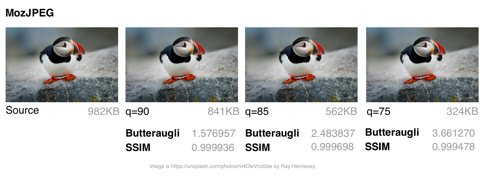
Я использовал jpeg-compress из проекта jpeg-archive для расчёта степени SSIM (структурного сходства) с исходным изображением. SSIM представляет собой метод измерения сходства между двумя изображениями, где степень SSIM является мерой качества одного изображения, относительно второго, «идеального» изображения.
По моему опыту, MozJPEG - хороший вариант для сжатия изображений для Интернета с высоким качеством изображения при одновременном сокращении размера файла. В случае небольших и средних файлов я обнаружил, что MozJPEG (при качестве = 80-85) обеспечил 30-40% экономии на размере файла при сохранении приемлемого SSIM, с 5-6% улучшением в режиме jpeg-turbo. Но он повышает затраты на кодирование, по сравнению с исходным JPEG, так что его преимущества не будут для вас актуальны.
Что такое Guetzli?
Guetzli это многообещающий, хотя и медленный, JPEG-кодировщик от Google, который пытается найти самый маленький JPEG, который на глаз неотличим от оригинала. Он выполняет последовательность экспериментов, которые делают предложение для окончательного JPEG, учитывающего психовизуальную ошибку каждого предположения. Из них он выбирает вариант с наивысшим баллом в качестве конечного результата.
Чтобы измерить различия между изображениями, Guetzli использует Butteraugli, модель для измерения разности изображений, основанной на восприятии человека (см. ниже). Guetzli может принять во внимание несколько свойств зрения, в отличие от других кодировщиков JPEG. Например, существует связь между количеством видимого зелёного света и восприятием синего, поэтому изменения в синем рядом с зелёным могут быть закодированы не так точно.
Guetzli утверждает, что он достигает 20-30 процентного сокращения размера изображений для заданного Butteraugli по сравнению с другими кодировщиками. Основным минусом Guetzli является то, что он чрезвычайно, очень медленный и в настоящее время подходит только для статического контента. Из README мы можем отметить, что для Guetzli требуется большой объем памяти - это может занять 1 минуту + 200 МБ оперативной памяти на мегапиксель. В этом обсуждении на GitHub описано применение Guetzli на практике. Он может быть идеальным, когда вы оптимизируете изображения в процессе сборки статического сайта, но не в случае выполнения в режиме реального времени.
Инструменты, такие как ImageOptim поддерживают оптимизацию Guetzli (в самой последней версии).
const gulp = require('gulp');
const imagemin = require('gulp-imagemin');
const imageminGuetzli = require('imagemin-guetzli');

gulp.task('guetzli', () =>
    gulp.src('src/*.jpg')
    .pipe(imagemin([
        imageminGuetzli({
            quality: 85
        })
    ]))
    .pipe(gulp.dest('dist'))

);
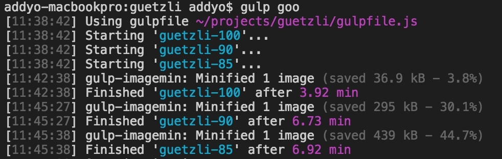
Потребовалось почти семь минут (при высокой загрузке процессора) для кодирования трёх 3MP изображений с использованием Guetzli с различными режимами сжатия. Думаю, что этот вариант более ценен для архивирования фотографий с более высоким разрешением.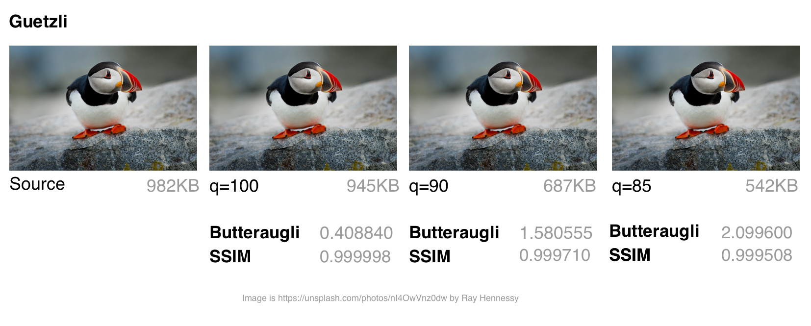
Хотя сжатие изображения с помощью Guetzli занимает очень (очень) много времени и заставляет ваши кулеры шуметь, в случае больших изображений оно того стоит. У меня было несколько случаев, где он сохранял до 40% размера файла при сохранении визуальной точности. Это делает его идеальным для архивирования фотографий. На изображениях малого и среднего размера наблюдалась некоторая экономия размера (в диапазоне 10-15 КБ), и она не была ярко выражена. Guetzli при сжатии может искажать (добавлять волноподобные искажения) мелкие изображения .
Вам также может быть интересно исследование Эрика Портиса(Eric Portis), сравнивающего Guetzli с автоматическим сжатием Cloudinary для другой точки зрения об эффективности алгоритма.
MozJPEG в сравнении с Guetzli
Сравнение разных кодировщиков JPEG сложная задача - нужно сравнить качество и точность соответствия сжатого изображения оригиналу, а также конечный размер. Как отмечает эксперт по сжатию изображений Корнель Лесински(Kornel Lesiński), сравнительный анализ одного, но не всех этих аспектов может привести к неверным выводам.
Как же Guetzli сравнить с MozJPEG? - Корнель считает что:
- Guetzli ориентирован на высококачественные изображения (butteraugli говорит, что на качество
q=90+, MozJPEG же лучше работает при качествеq=75) - Guetzli намного медленнее при сжатии (оба генерируют стандартный JPEG, так что декодирование выполняется как обычно)
- MozJPEG не устанавливает настройки качества автоматически, но вы можете подобрать параметры с помощью сторонних инструментов, например jpeg-archive
Существует ряд методов для определения, являются ли сжатые изображения визуально или воспринимаемо, похожими на их источники. Исследования качества изображения часто используют такие методы, как SSIM (структурное сходство). Однако Guetzli оптимизирован для Butteraugli.
Butteraugli
Butteraugli - это проект Google, который оценивает тот момент, когда человек может заметить визуальное ухудшение (психовизуальное сходство) среди двух изображений. Он даёт оценку для едва заметных различий. Butteraugli не только даёт скалярную оценку, но и вычисляет пространственную карту уровня различий. Т.е. SSIM определяет совокупность ошибок в изображении и на этом основании ставит оценку, Butteraugli оценивает по худшей области изображения.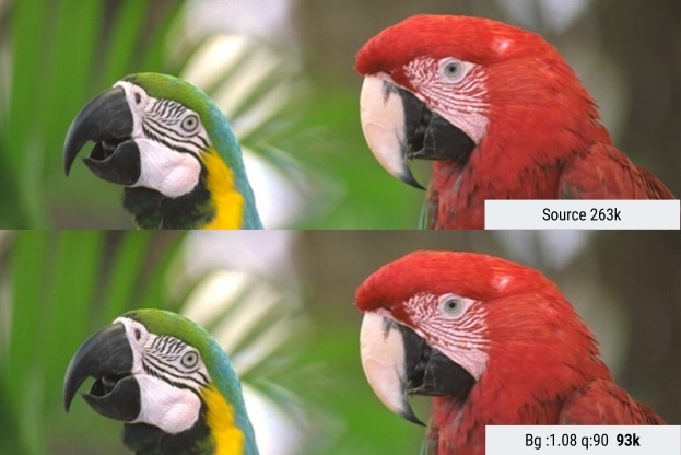
На практике вы определяете целевой уровень визуального качества, а затем выполняете несколько различных стратегий оптимизации изображений, глядя на оценки Butteraugli, прежде чем выбрать то, что соответствует лучшему балансу размера файла и уровня.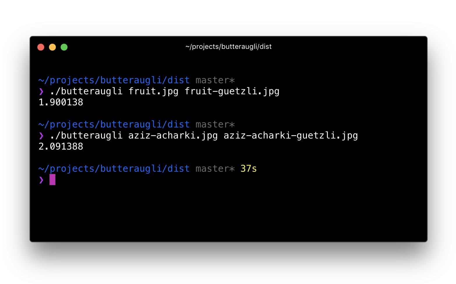
Что отличает Butteraugli от других способов сравнения визуального сходства?
Этот комментарий от участника проекта Guetzli предполагает, что Guetzli лучше всего при сравнении с помощью Butteraugli и хуже всего на SSIM, тогда как оценки MozJPEG одинаковы в обоих тестах. Это соответствует исследованию, на основании которого я составил свою собственную стратегию оптимизации изображений. Я использую Butteraugli и Node модуль вроде img-ssim, которым даю сжатые изображения, и они сравниваю исходное изображение с их оценками SSIM до/после Guetzli и MozJPEG.
Можно ли комбинировать кодировщики?
Для больших изображений я обнаружил, что сочетание Guetzli со сжатием без потерь и MozJPEG (с использованием jpegtran, а не cjpeg, чтобы избежать отбрасывания работы, сделанной Guetzli), может привести к дополнительному уменьшению размера файла на 10-15% (всего 55%) с очень незначительными сокращениями по SSIM. Этот вариант требует анализа, и я бы поостерёгся использовать его в работе, но он был опробован другими специалистами, например Ария Хидаят(Ariya Hidayat), и их исследования показали перспективы данного варианта.
MozJPEG - удобный для новичков кодировщик веб-ресурсов, относительно быстрый и создающий на выходе качественные изображения. Поскольку Guetzli является ресурсоёмким и работает лучше всего на больших высококачественных изображениях, я бы его оставил более продвинутым пользователям.
What is WebP?
WebP is a recent image format from Google aiming to offer lower file-sizes for lossless and lossy compression at an acceptable visual quality. It includes support for alpha-channel transparency and animation.
In the last year, WebP gained a few percent over compression-wise in lossy and lossless modes and speed-wise the algorithm got twice as fast with a 10% improvement in decompression. WebP is not a tool for all purposes, but it has some standing and a growing user base in the image compression community. Let’s examine why.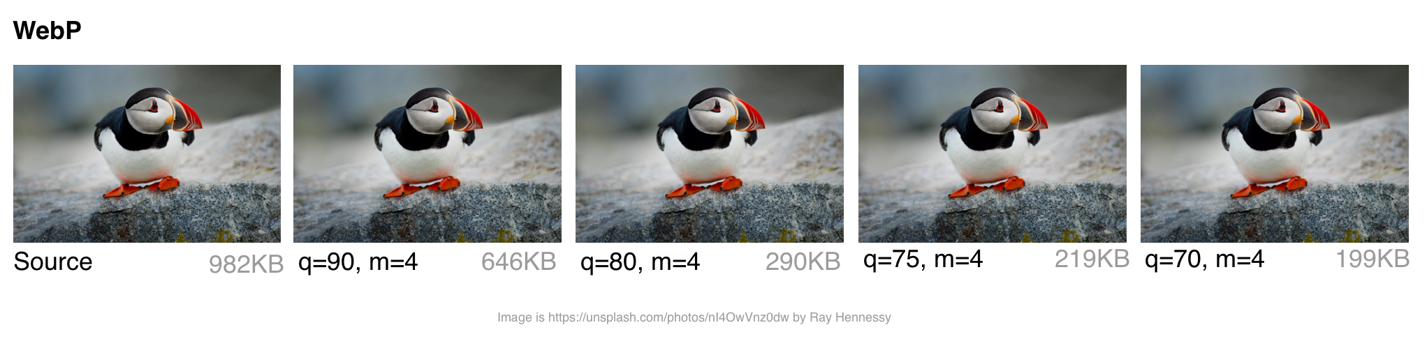
How does WebP perform?
Lossy Compression
WebP lossy files, using a VP8 or VP9 video key frame encoding variant, are on average cited by the WebP team as being 25-34% smaller than JPEG files.
In the low-quality range (0-50), WebP has a large advantage over JPEG because it can blur away ugly blockiness artifacts. A medium quality setting (-m 4 -q 75) is the default balancing speed/file-size. In the higher-range (80-99), the advantages of WebP shrink. WebP is recommended where speed matters more than quality.
Lossless Compression
WebP lossless files are 26% smaller than PNG files. The lossless load-time decrease compared to PNG is 3%. That said, you generally don’t want to deliver your users lossless on the web. There’s a difference between lossless and sharp edges (e.g. non-JPEG). Lossless WebP may be more suitable for archival content.
Transparency
WebP has a lossless 8-bit transparency channel with only 22% more bytes than PNG. It also supports lossy RGB transparency, which is a feature unique to WebP.
Metadata
The WebP file format supports EXIF photo metadata and XMP digital document metadata. It also contains an ICC Color Profile.
WebP offers better compression at the cost of being more CPU intensive. Back in 2013, the compression speed of WebP was ~10× slower than JPEG but is now negligible (some images may be 2× slower). For static images that are processed as part of your build, this shouldn’t be a large issue. Dynamically generated images will likely cause a perceivable CPU overhead and will be something you will need to evaluate.
Who’s using WebP in production?
Many large companies are using WebP in production to reduce costs and decrease web page load times.
Google reported 30-35% savings using WebP over other lossy compression schemes, serving 43 billion image requests a day, 26% of that being lossless compression. That’s a lot of requests and significant savings. Savings would undoubtedly be larger if browser support were better and more widespread. Google also uses it in production sites like Google Play and YouTube.
Netflix, Amazon, Quora, Yahoo, Walmart, Ebay, The Guardian, Fortune, and USA Today, all compress and serve images with WebP for browsers which support it. VoxMedia shaved 1-3s off load times for The Verge by switching over to WebP for their Chrome users. 500px saw an average 25% reduction in image file size with similar or better image quality when switching to serving it to their Chrome users.
There are quite a few more companies on board than this sample list indicates.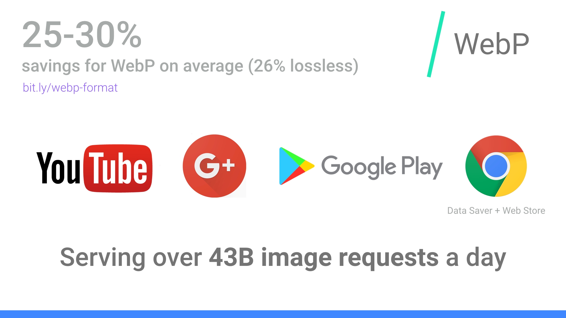
How does WebP encoding work?
WebP’s lossy encoding is designed to compete with JPEG for still images. There are three key phases to WebP’s lossy encoding:
Macro-blocking – splitting an image into 16×16 (macro) blocks of luma pixels and two 8×8 blocks of chroma pixels. This may sound familiar to the idea of JPEGs doing color space conversion, chroma channel downsampling and image subdivision.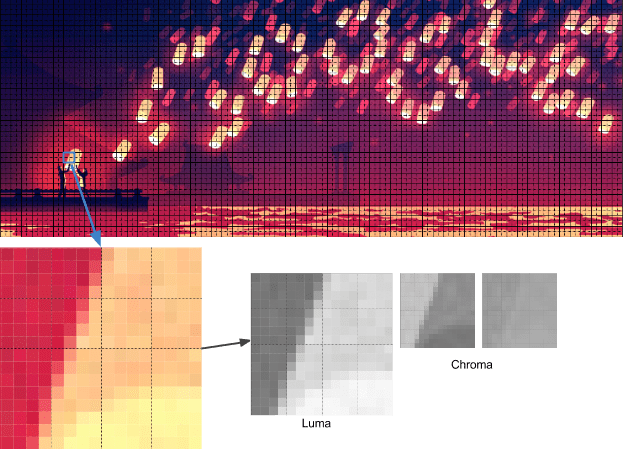
Prediction – every 4×4 subblock of a macroblock has a prediction model applied that effectively does filtering. This defines two sets of pixels around a block – A (the row directly above it) and L (the column to the left of it). Using these two the encoder fills a test block with 4×4 pixels and determines which creates values closest to the original block. Colt McAnlis talks about this in more depth in How WebP lossy mode works.
A Discrete Cosine Transform (DCT) is applied with a few steps similar to JPEG encoding. A key difference is use of an Arithmetic Compressor vs JPEG’s Huffman.
If you want to dive deeper, Google Developer’s article WebP Compression Techniques goes into this topic in depth.
WebP browser support
Not all browsers support WebP, however according to CanIUse.com, global user support is at about 74%. Chrome and Opera natively support it. Safari, Edge, and Firefox have experimented with it but not landed it yet in official releases. This often leaves the task of getting the WebP image to the user up to the web developer. More on this later.
Here are the major browsers and support information for each:
- Chrome: Chrome began full support at version 23.
- Chrome for Android: Since Chrome 50
- Android: Since Android 4.2
- Opera: Since 12.1
- Opera Mini: All versions
- Firefox: Some beta support
- Edge: Some beta support
- Internet Explorer: No support
- Safari: Some beta support
WebP is not without its downsides. It lacks full-resolution color space options and does not support progressive decoding. That said, tooling for WebP is decent and browser-support, while limited to Chrome and Opera at the time of writing, may well cover enough of your users for it to be worth considering with a fallback.
How do I convert my images to WebP?
Several commercial and open source image editing and processing packages support WebP. One particularly useful application is XnConvert: a free, cross-platform, batch image processing converter.
XnConvert enables batch image processing, compatible with over 500 image formats. You can combine over 80 separate actions to transform or edit your images in multiple ways.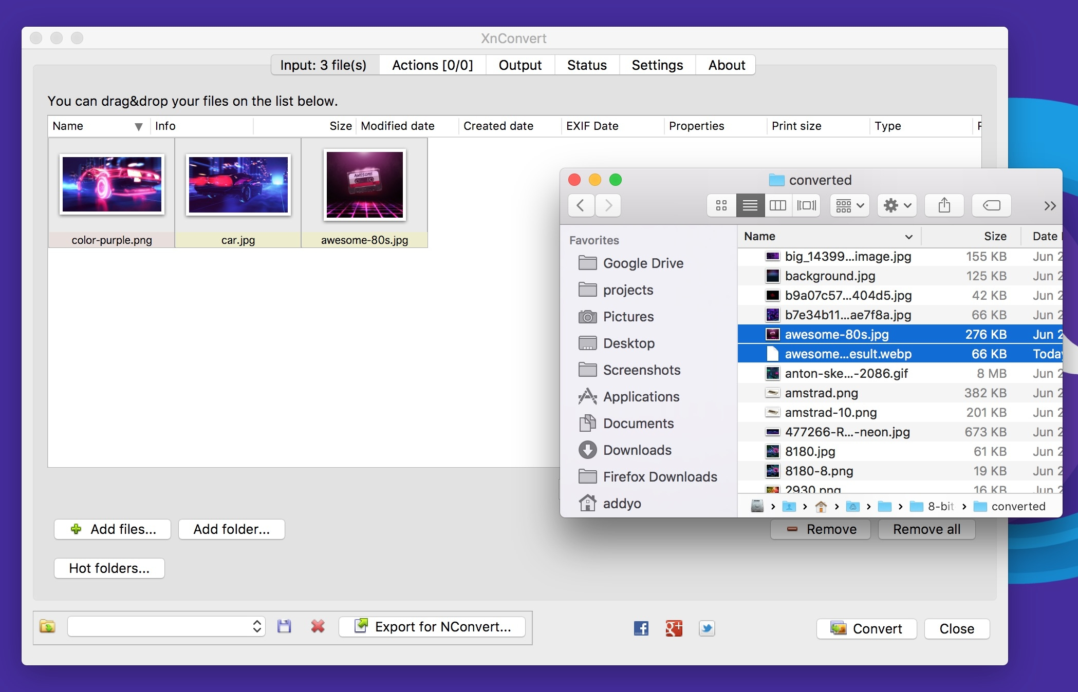
Some of the options listed on the xnview website include:
- Metadata: Editing
- Transforms: Rotate, Crop, Resize
- Adjustments: Brightness, Contrast, Saturation
- Filters: Blur, Emboss, Sharpen
- Effects: Masking, Watermark, Vignetting
The results of your operations can be exported to about 70 different file formats, including WebP. XnConvert is free for Linux, Mac, and Windows. XnConvert is highly recommended, especially for small businesses.
Node modules
Imagemin is a popular image minification module that also has an add-on for converting images to WebP (imagemin-webp). This supports both lossy and lossless modes.
To install imagemin and imagemin-webp run:
> npm install --save imagemin imagemin-webp
We can then require() in both modules and run them over any images (e.g. JPEGs) in a project directory. Below we’re using lossy encoding with a WebP encoder quality of 60:
const imagemin = require('imagemin');
const imageminWebp = require('imagemin-webp');

imagemin(['images/*.{jpg}'], 'images', {
    use: [
        imageminWebp({quality: 60})
    ]
}).then(() => {
    console.log(‘Images optimized’);
});
Similar to JPEGs, it’s possible to notice compression artefacts in our output. Evaluate what quality setting makes sense for your own images. Imagemin-webp can also be used to encode lossless quality WebP images (supporting 24-bit color and full transparency) by passing lossless: true to options:
const imagemin = require('imagemin');
const imageminWebp = require('imagemin-webp');

imagemin(['images/*.{jpg,png}'], 'build/images', {
    use: [
        imageminWebp({lossless: true})
    ]
}).then(() => {
    console.log(‘Images optimized’);
});
A WebP plugin for Gulp by Sindre Sorhus built on imagemin-webp and a WebP loader for WebPack are also available. The Gulp plugin accepts any options the imagemin add-on does:
const gulp = require('gulp');
const webp = require('gulp-webp');

gulp.task('webp', () =>
    gulp.src('src/*.jpg')
    .pipe(webp({
        quality: 80,
        preset: 'photo',
        method: 6
    }))
    .pipe(gulp.dest('dist'))
);
Or lossless:
const gulp = require('gulp');
const webp = require('gulp-webp');

gulp.task('webp-lossless', () =>
    gulp.src('src/*.jpg')
    .pipe(webp({
        lossless: true
    }))
    .pipe(gulp.dest('dist'))
);
Batch image optimization using Bash
XNConvert supports batch image compression, but if you would prefer to avoid using an app or a build system, bash and image optimization binaries keep things fairly simple.
You can bulk convert your images to WebP using cwebp:
find ./ -type f -name '*.jpg' -exec cwebp -q 70 {} -o {}.webp \;
Or bulk optimize your image sources with MozJPEG using jpeg-recompress:
find ./ -type f -name '*.jpg' -exec jpeg-recompress {} {} \;
and trim those SVGs down using svgo (which we’ll cover later on):
find ./ -type f -name '*.svg' -exec svgo {} \;
Jeremy Wagner has a more comprehensive post on image optimization using Bash and another on doing this work in parallel worth reading.
Other WebP image processing and editing apps include:
- Leptonica — An entire website of open source image processing and analysis Apps.
- Sketch supports outputting directly to WebP
- GIMP — Free, open source Photoshop alternative. Image editor.
- ImageMagick — Create, compose, convert, or edit bitmap images. Free. Command-Line app.
- Pixelmator — Commercial image editor for Mac.
- Photoshop WebP Plugin — Free. Image import and export. From Google.
Android: You can convert existing BMP, JPG, PNG or static GIF images to WebP format using Android Studio. For more information, see Create WebP Images Using Android Studio.
How do I view WebP images on my OS?
While you can drag and drop WebP images to Blink-based browsers (Chrome, Opera, Brave) to preview them, you can also preview them directly from your OS using an add-on for either Mac or Windows.
Facebook experimented with WebP a few years ago and found that users who tried to right-click on photos and save them to disk noticed they wouldn’t be displayed outside their browser due to them being in WebP. There were three key problems here:
- "Save as" but unable to view WebP files locally. This was fixed by Chrome registering itself as a ".webp" handler.
- "Save as" then attaching the image to an email and sharing with someone without Chrome. Facebook solved this by introducing a prominent "download" button in their UI and returning a JPEG when users requested the download.
- Right click > copy URL -> share URL on the web. This was solved by content-type negotiation.
These issues might matter less to your users, but is an interesting note on social shareability in passing. Thankfully today, utilities exist for viewing and working with WebP on different operating systems.
On Mac, try the Quick Look plugin for WebP (qlImageSize). It works pretty well:
On Windows, you can also download the WebP codec package allowing WebP images to be previewed in the File Explorer and Windows Photo Viewer.
How do I serve WebP?
Browsers without WebP support can end up not displaying an image at all, which isn’t ideal. To avoid this there are a few strategies we can use for conditionally serving WebP based on browser support.
Here are some of the options for getting WebP images from your server to your user:
Using .htaccess to Serve WebP Copies
Here’s how to use a .htaccess file to serve WebP files to supported browsers when a matching .webp version of a JPEG/PNG file exists on the server.
Vincent Orback recommended this approach:
Browsers can signal WebP support explicitly via an Accept header. If you control your backend, you can return a WebP version of an image if it exists on disk rather than formats like JPEG or PNG. This isn’t always possible however (e.g. for static hosts like GitHub pages or S3) so be sure to check before considering this option.
Here is a sample .htaccess file for the Apache web server:
<IfModule mod_rewrite.c>

  RewriteEngine On

  # Check if browser support WebP images
  RewriteCond %{HTTP_ACCEPT} image/webp

  # Check if WebP replacement image exists
  RewriteCond %{DOCUMENT_ROOT}/$1.webp -f

  # Serve WebP image instead
  RewriteRule (.+)\.(jpe?g|png)$ $1.webp [T=image/webp,E=accept:1]

</IfModule>

<IfModule mod_headers.c>

    Header append Vary Accept env=REDIRECT_accept

</IfModule>

AddType  image/webp .webp
If there are issues with the .webp images appearing on the page, make sure that the image/webp MIME type is enabled on your server.
Apache: add the following code to your .htaccess file:
AddType image/webp .webp
Nginx: add the following code to your mime.types file:
image/webp webp;
Using the <picture> Tag
The browser itself is capable of choosing which image format to display through the use of the <picture> tag. The <picture> tag utilizes multiple <source> elements, with one <img> tag, which is the actual DOM element which contains the image. The browser cycles through the sources and retrieves the first match. If the <picture> tag isn’t supported in the user’s browser, a <div> is rendered and the <img> tag is used.
Here is some sample HTML:
<picture>
  <source srcset="/path/to/image.webp" type="image/webp">
  <img src="/path/to/image.jpg" alt="">
</picture>

<picture>
    <source srcset='paul_irish.jxr' type='image/vnd.ms-photo'>
    <source srcset='paul_irish.jp2' type='image/jp2'>
    <source srcset='paul_irish.webp' type='image/webp'>
    <img src='paul_irish.jpg' alt='paul'>
</picture>

<picture>
   <source srcset="photo.jxr" type="image/vnd.ms-photo">
   <source srcset="photo.jp2" type="image/jp2">
   <source srcset="photo.webp" type="image/webp">
   <img src="photo.jpg" alt="My beautiful face">
</picture>
Automatic CDN conversion to WebP
Some CDNs support automated conversion to WebP and can use client hints to serve up WebP images whenever possible. Check with your CDN to see if WebP support is included in their service. You may have an easy solution just waiting for you.
WordPress WebP support
Jetpack — Jetpack, a popular WordPress plugin, includes a CDN image service called Photon. With Photon you get seamless WebP image support. The Photon CDN is included in Jetpack's free level, so this is a good value and a hands-off implementation. The drawback is that Photon resizes your image, puts a query string in your URL and there is an extra DNS lookup required for each image.
Cache Enabler and Optimizer — If you are using WordPress, there is at least one halfway-open source option. The open source plugin Cache Enabler has a menu checkbox option for caching WebP images to be served if available and the current user’s browser supports them. This makes serving WebP images easy. There is a drawback: Cache Enabler requires the use of a sister program called Optimizer, which has an annual fee. This seems out of character for a genuinely open source solution.
Short Pixel — Another option for use with Cache Enabler, also at a cost, is Short Pixel. Short Pixel functions much like Optimizer, described above. You can optimize up to 100 images a month for free.
Compressing Animated GIFs and why <video> is better
Animated GIFs continue to enjoy widespread use, despite being a very limited format. Although everything from social networks to popular media sites embed animated GIFs heavily, the format was never designed for video storage or animation. In fact, the GIF89a spec notes ‘the GIF is not intended as a platform for animation’. The number of colors, number of frames and dimensions all impact animated GIF size. Switching to video offers the largest savings.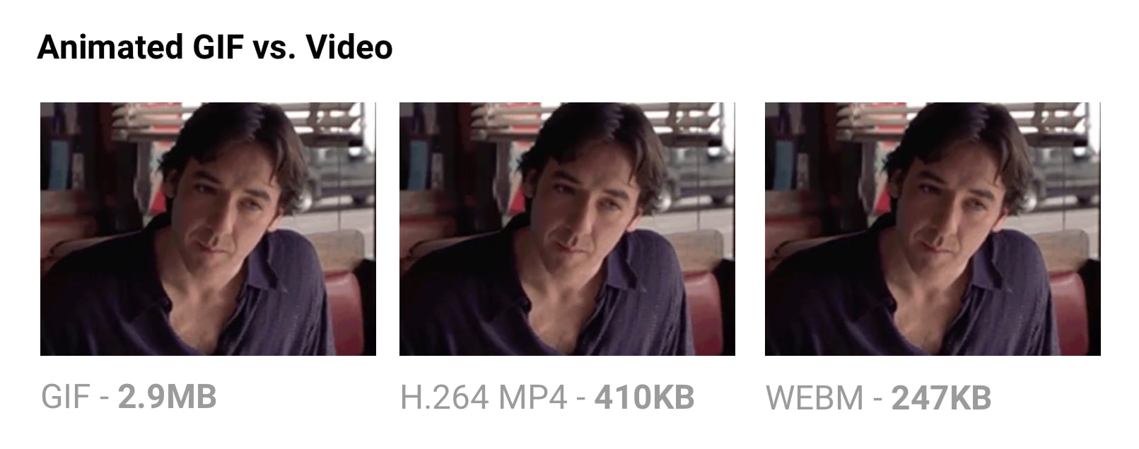
Delivering the same file as an MP4 video can often shave 80% or more off your file-size. Not only do GIFs often waste significant bandwidth, but they take longer to load, include fewer colors and generally offer sub-part user experiences. You may have noticed animated GIFs uploaded to Twitter perform better on Twitter than on other websites. Animated GIFs on Twitter aren’t actually GIFs. To improve user experience and reduce bandwidth consumption, animated GIFs uploaded to Twitter are actually converted to video. Similarly, Imgur converts GIFs to videos on upload, silently converting it to an MP4 for you.
Why are GIFs many times larger? Animated GIFs store each frame as a lossless GIF image – yes, lossless. The degraded quality we often experience is due to GIFs being limited to a 256-color palette. The format is often large as it doesn’t consider neighbor frames for compression, unlike video codecs like H.264. An MP4 video stores each key frame as a lossy JPEG, which discards some of the original data to achieve better compression.
If you can switch to videos
- Use ffmpeg to convert your animated GIFs (or sources) to H.264 MP4s. I use this one-liner from Rigor: ffmpeg -i animated.gif -movflags faststart -pix_fmt yuv420p -vf "scale=trunc(iw/2)2:trunc(ih/2)2" video.mp4
- ImageOptim API also supports converting animated gifs to WebM/H.264 video, removing dithering from GIFs which can help video codecs compress even more.
If you must use animated GIFs
- Tools like Gifsicle can strip metadata, unused palette entries and minimize what changes between frames
- Consider a lossy GIF encoder. The Giflossy fork of Gifsicle supports this with the
—lossyflag and can shave ~60-65% off size. There’s also a nice tool based on it called Gifify. For non-animated GIFs, convert them to PNG or WebP.
For more information, checkout the Book of GIF by Rigor.
SVG Optimization
Keeping SVGs lean means stripping out anything unnecessary. SVG files created with editors usually contain a large quantity of redundant information (metadata, comments, hidden layers and so forth). This content can often be safely removed or converted to a more minimal form without impacting the final SVG that’s being rendered.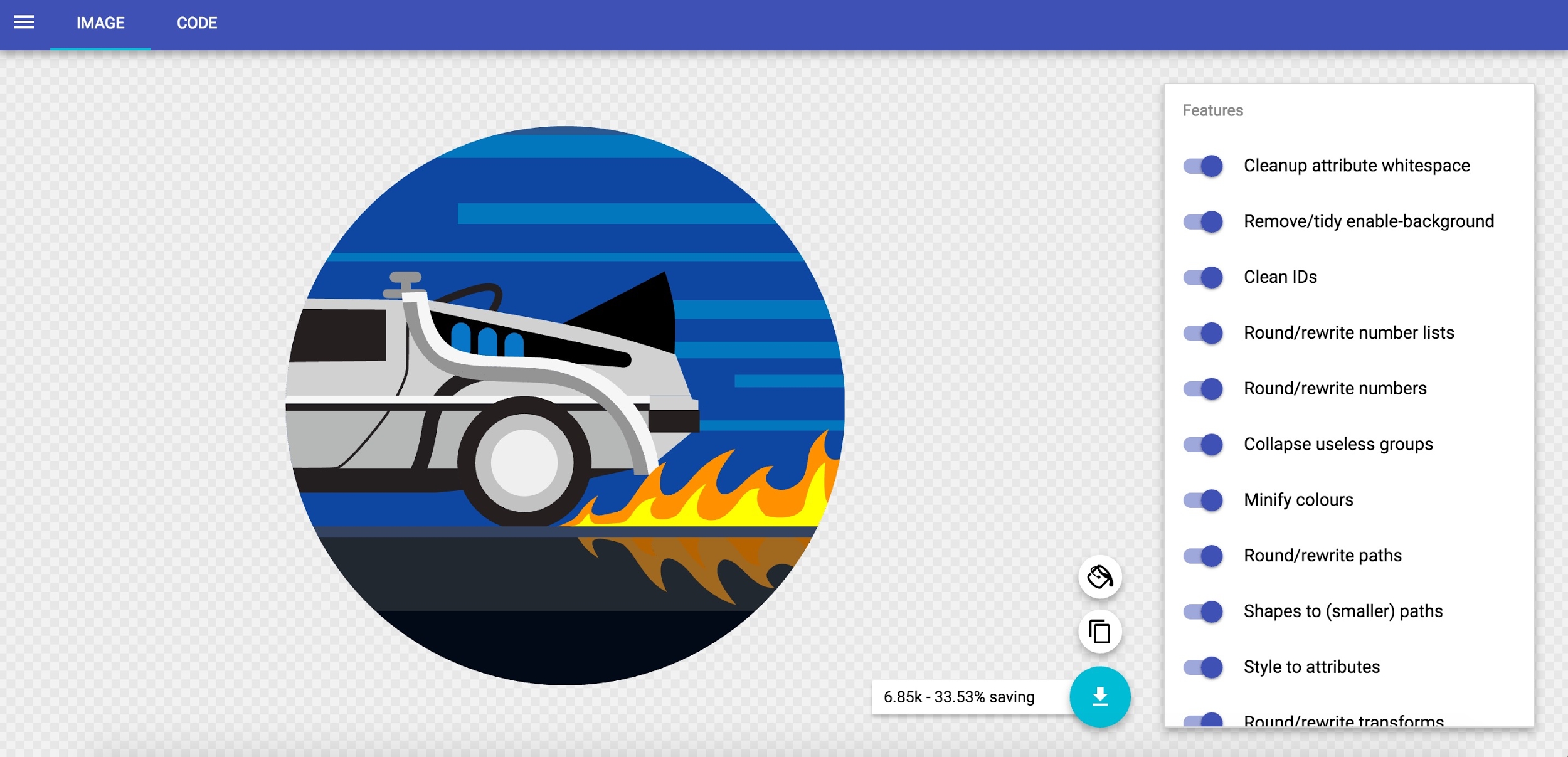
Some general rules for SVG optimization (SVGO):
- Minify and gzip your SVG files. SVGs are really just text assets expressed in XML, like CSS, HTML and JavaScript, and should be minified and gzipped to improve performance.
- Instead of paths, use predefined SVG shapes like
<rect>,<circle>,<ellipse>,<line>and<polygon>. Preferring predefined shapes decreases how much markup is needed to produce a final image, meaning less code to parse and rasterize by the browser. Reducing SVG complexity means a browser can display it more quickly. - If you must use paths, try to reduce your curves and paths. Simplify and combine them where you can. Illustrator’s simplify tool is adept at removing superfluous points in even complex artwork while smoothing out irregularities.
- Avoid using groups. If you can’t, try to simplify them.
- Delete layers that are invisible.
- Avoid any Photoshop or Illustrator effects. They can get converted to large raster images.
- Double check for any embedded raster images that aren’t SVG-friendly
- Use a tool to optimize your SVGs. SVGOMG is a super handy web-based GUI for SVGO by Jake Archibald that I’ve found invaluable. If you use Sketch, the SVGO Compressor plugin) can be used when exporting to shrink the file size.
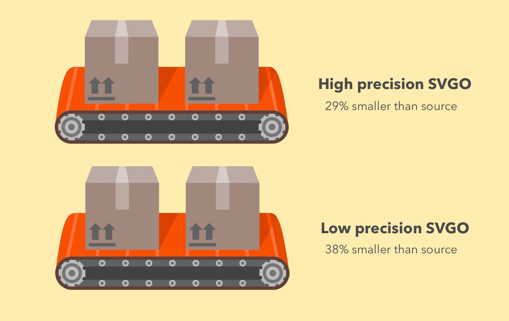
SVGO is a Node-based tool for optimizing SVG. SVGO can reduce file-size by lowering the precision of numbers in your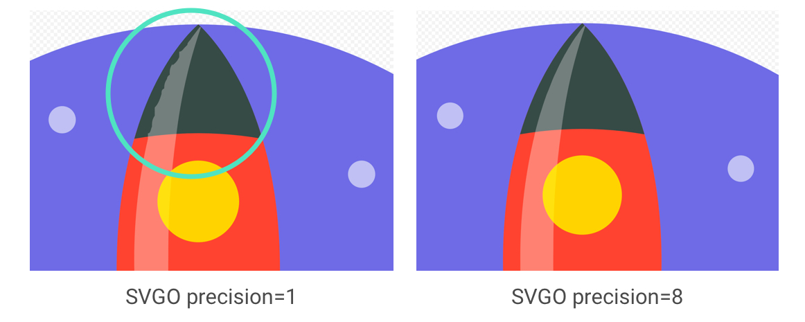
Using SVGO at the command-line:
SVGO can be installed as a global npm CLI should you prefer that to a GUI:
npm i -g svgo
This can then be run against a local SVG file as follows:
svgo input.svg -o output.svg
It supports all the options you might expect, including adjusting floating point precision:
svgo input.svg --precision=1 -o output.svg
See the SVGO readme for the full list of supported options.
Don’t forget to compress SVGs!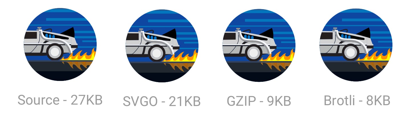
Also, don’t forget to Gzip your SVG assets or serve them using Brotli. As they’re text based, they’ll compress really well (~50% of the original sources).
When Google shipped a new logo, we announced that the smallest version of it was only 305 bytes in size.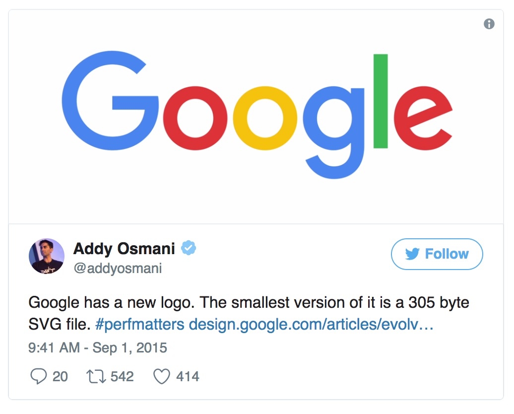
There are lots of advanced SVG tricks you can use to trim this down even further (all the way to 146 bytes)! Suffice to say, whether it’s through tools or manual clean-up, there’s probably a little more you can shave off your SVGs.
SVG Sprites
SVG can be powerful for icons, offering a way to represent visualizations as a sprite without the quirky workarounds needed for icon fonts. It has more granular CSS styling control than icon fonts (SVG stroke properties), better positioning control (no need to hack around pseudo-elements and CSS display) and SVGs are much more accessible.
Tools like svg-sprite and IcoMoon can automate combining SVGs into sprites which can be used via a CSS Sprite, Symbol Sprite or Stacked Sprite. Una Kravetz has a practical write-up on how to use gulp-svg-sprite for an SVG sprite workflow worth checking out. Sara Soudein also covers making the transition from icon fonts to SVG on her blog.
Further reading
Sara Soueidan’s tips for optimising SVG delivery for the web and Chris Coyier’s Practical SVG book are excellent. I’ve also found Andreas Larsen’s optimizing SVG posts enlightening (part 1,part 2).Preparing and exporting SVG icons in Sketch was also a great read.
Avoid recompressing images with lossy codecs
It is recommended to always compress from the original image. Recompressing images has consequences. Let’s say you take a JPEG that’s already been compressed with a quality of 60. If you recompress this image with lossy encoding, it will look worse. Each additional round of compression is going to introduce generational loss – information will be lost and compression artifacts will start to build up. Even if you’re re-compressing at a high quality setting.
To avoid this trap, set the lowest good quality you’re willing to accept in the first place and you’ll get maximum file savings from the start. You then avoid this trap because any file-size reductions from quality reduction alone will look bad.
Re-encoding a lossy file will almost always give you a smaller file, but this doesn’t mean you’re getting as much quality out of it as you may think.
MozJPEG (perhaps accidentally) has a better resistance to recompression degradation thanks to trellis quantization. Instead of compressing all DCT values as they are exactly, it can check close values within a +1/-1 range to see if similar values compress to fewer bits. Lossy FLIF has a hack similar to lossy PNG in that prior to (re)compression, it can look at the data and decide what to throw away. Recompressed PNGs have ‘holes’ it can detect to avoid changing data further.
When editing your source files, store them in a lossless format like PNG or TIFF, so you preserve as much quality as you can. Your build tools or image compression service than then handle outputting the compressed version you serve to users with minimal loss in quality.
Reduce unnecessary image decode and resize costs
We’ve all shipped large, higher resolution images than needed to our users before. This has a cost to it. Decoding and resizing images are expensive operations for a browser on average mobile hardware. If sending down large images and rescaling using CSS or width/height attributes, you’re likely to see this happen and it can impact performance.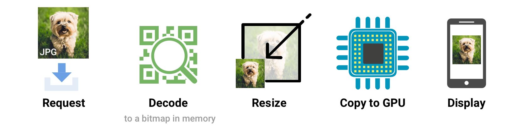
Sending down images that a browser can render without needing to resize at all is ideal. So, serve the smallest images for your target screen sizes and resolutions, taking advantage of srcset and sizes – we’ll cover srcset shortly.
Omitting the width or height attributes on an image can also negatively impact performance. Without them, a browser assigns a smaller placeholder region for the image until sufficient bytes have arrived for it to know the correct dimensions. At that point, the document layout must be updated in what can be a costly step called reflow.
Larger images also come with an increase in memory size costs. Decoded images are ~4 bytes per pixel. If you’re not careful, you can literally crash the browser; on low-end devices it doesn’t take that much to start memory swapping. So, keep an eye on your image decode, resize and memory costs.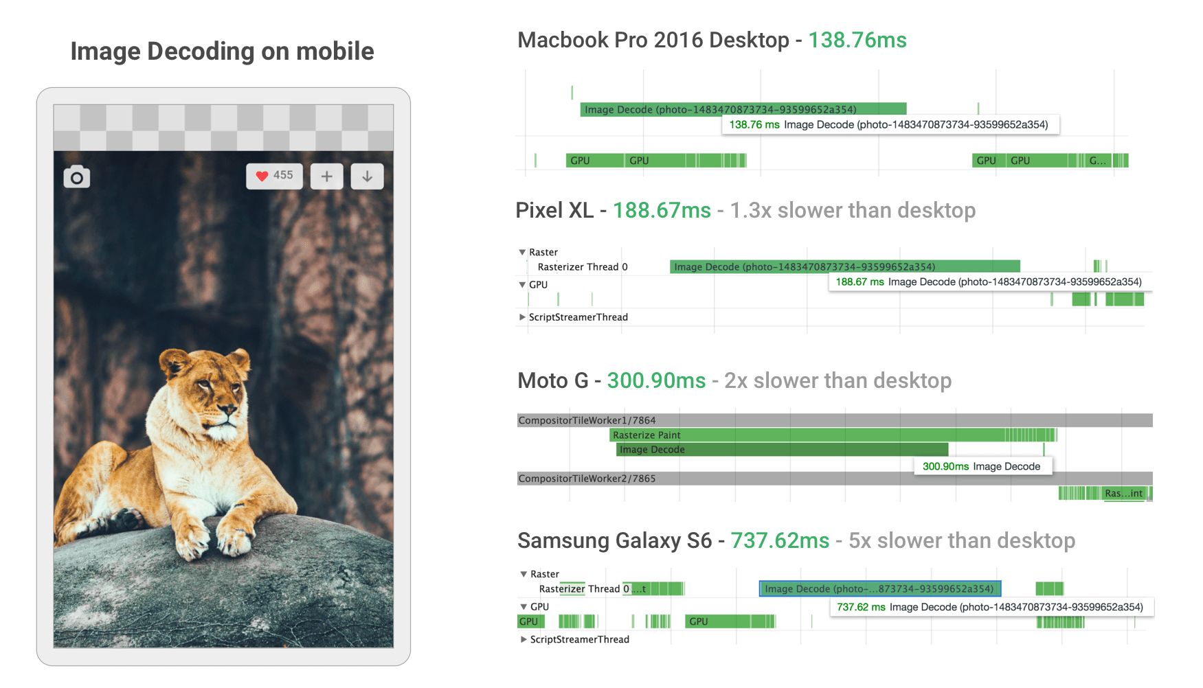
When building their new mobile web experience, Twitter improved image decode performance by ensuring they served appropriately sized images to their users. This took decode time for many images in the Twitter timeline from ~400ms all the way down to ~19!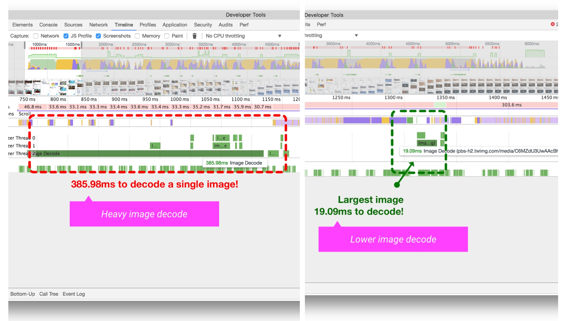
Delivering HiDPI images using srcset
Users may access your site through a range of mobile and desktop devices with high-resolution screens. The Device Pixel Ratio (DPR) (also called the ‘CSS pixel ratio’) determines how a device’s screen resolution is interpreted by CSS. DPR was created by phone manufacturers to enable increasing the resolution and sharpness of mobile screens without making elements appear too small.
To match the image quality users might expect, deliver the most appropriate resolution images to their devices. Sharp, high-DPR images (e.g. 2×, 3×) can be served to devices that support them. Low and standard-DPR images should be served to users without high-res screens as such 2×+ images will often weigh significantly more bytes.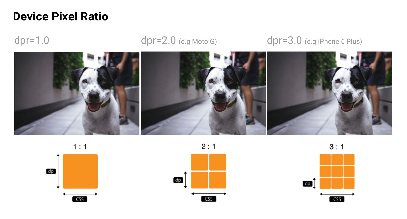
srcset allows a browser to select the best available image per device, e.g. selecting a 2× image for a 2× mobile display. Browsers without srcset support can fallback to the default src specified in the <img> tag.
<img srcset="paul-irish-320w.jpg,
             paul-irish-640w.jpg 2x,
             paul-irish-960w.jpg 3x"
     src="paul-irish-960w.jpg" alt="Paul Irish cameo">
Image CDNs like Cloudinary and Imgix both support controlling image density to serve the best density to users from a single canonical source.
A friendly reminder that Client Hints can also provide an alternative to specifying each possible pixel density and format in your responsive image markup. Instead, they append this information to the HTTP request so web servers can pick the best fit for the current device’s screen density.
Art direction
Although shipping the right resolution to users is important, some sites also need to think about this in terms of art direction. If a user is on a smaller screen, you may want to crop or zoom in and display the subject to make best use of available space. Although art direction is outside the scope of this write-up, services like Cloudinary provide APIs to try automating this as much as possible.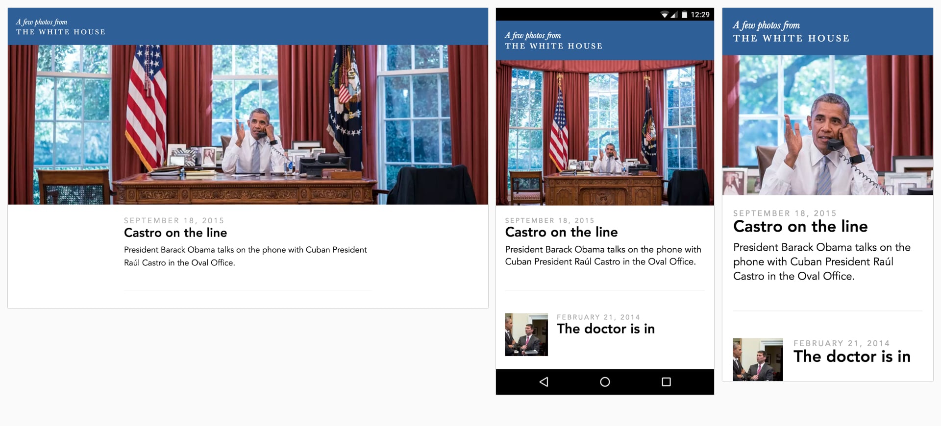
Color management
There are at least three different perspectives of color: biology, physics and print. In biology, color is a perceptual phenomenon. Objects reflect light in different combinations of wavelengths. Light receptors in our eyes translate these wavelengths into the sensation we know as color. In physics, it’s light that matters – light frequencies and brightness. Print is more about color wheels, inks and artistic models.
Ideally, every screen and web browser in the world would display color exactly the same. Unfortunately, due to a number of inherent inconsistencies, they don’t. Color management allows us to reach a compromise on displaying color through color models, spaces and profiles.
Color models
Color models are a system for generating a complete range of colors from a smaller set of primary colors. There are different types of color spaces which use different parameters to control colors. Some color spaces have fewer control parameters than others – e.g. grayscale only has a single parameter for controlling brightness between black and white colors.
Two common color models are additive and subtractive. Additive color models (like RGB, used for digital displays) use light to show color while subtractive color models (like CMYK, used in printing) work by taking light away.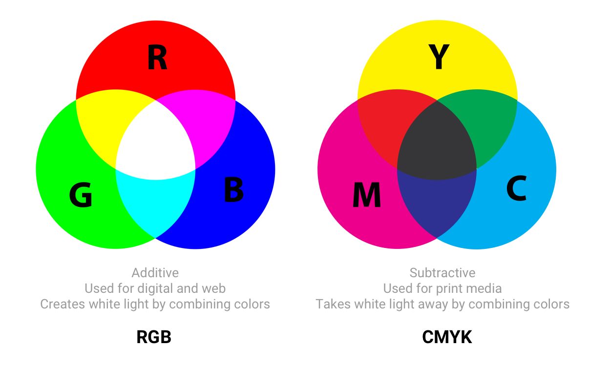
Understanding Color Models and Spot Color Systems has a good description of other color models and modes, such as HSL, HSV and LAB.
Color spaces
Color spaces are a specific range of colors that can be represented for a given image. For example, if an image contains up to 16.7 million colors, different color spaces allow the use of narrower or wider ranges of these colors. Some developers refer to color models and color spaces as the same thing.
sRGB was designed to be a standard color space for the web and is based on RGB. It’s a small color space that is typically considered the lowest common denominator and is the safest option for color management cross-browser. Other color spaces (such as Adobe RGB or ProPhoto RGB – used in Photoshop and Lightroom) can represent more vibrant colors than sRGB but as the latter is more ubiquitous across most web browsers, games and monitors, it’s what is generally focused on.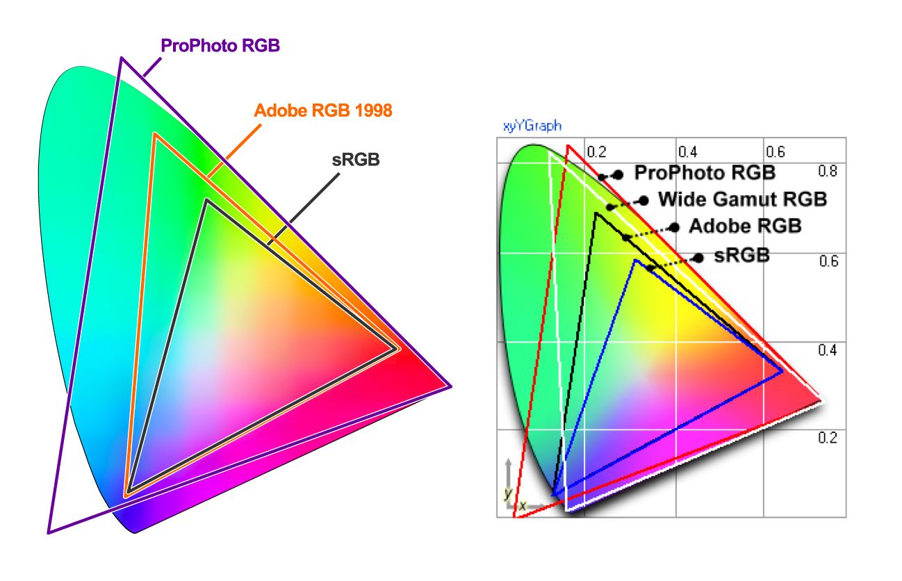
Color spaces have three channels (red, green and blue). There are 255 colors possible in each channel under 8-bit mode, bringing us to a total of 16.7 million colors. 16-bit images can show trillions of colors.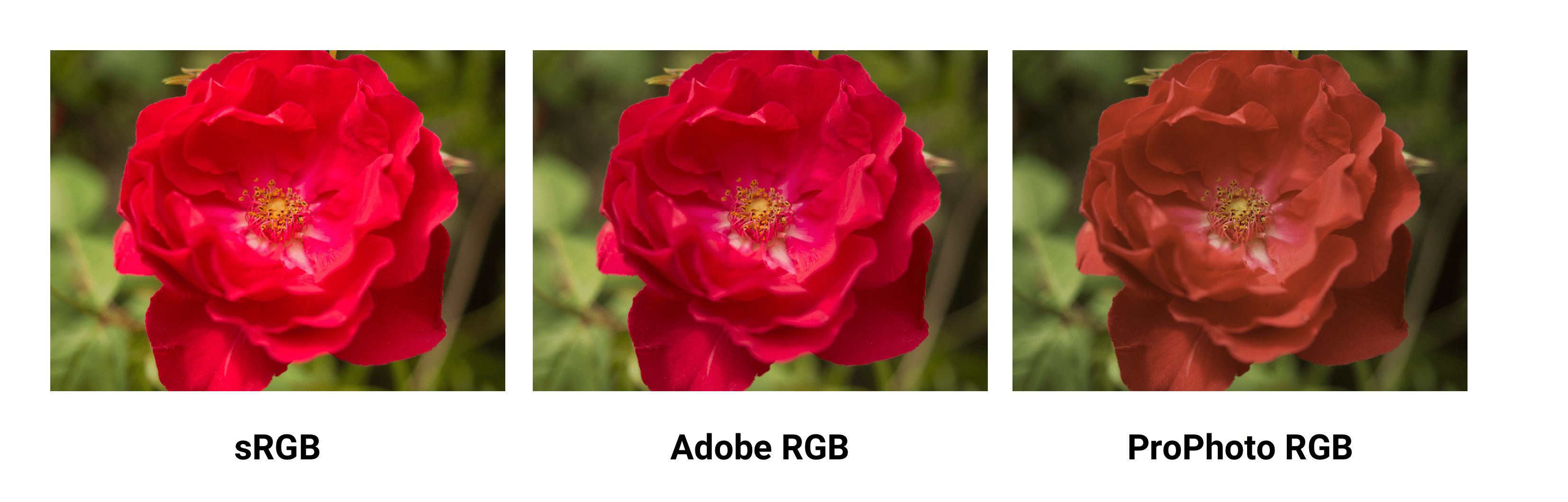
The differences in color spaces (like sRGB, Adobe RGB and ProPhoto RGB) are their gamut (the range of colors they can reproduce with shades), illuminant and gamma curves. sRGB is ~20% smaller than Adobe RGB and ProPhoto RGB is ~50% larger than Adobe RGB. The above image sources are from Clipping Path.
Wide-gamut is a term describing color spaces with a gamut larger than sRGB. These types of displays are becoming more common. That said, many digital displays are still simply unable to display color profiles that are significantly better than sRGB. When saving for the web in Photoshop, consider using the ‘Convert to sRGB’ option unless targeting users with higher-end wide-gamut screens.
Are there any cases where wide gamut makes sense for web content?
Yes. If an image contains very saturated/juicy/vibrant color and you care about it being just as juicy on screens that support it. However, in real photos that rarely happens. Often it’s easy to tweak color to make it appear vibrant, without it actually exceeding sRGB gamut
That’s because human color perception is not absolute, but relative to our surroundings and is easily fooled. If your image contains a fluorescent highlighter color, then you’ll have an easier time with wide gamut.
Gamma correction and compression
Gamma correction (or just Gamma) controls the overall brightness of an image. Changing the gamma can also alter the ratio of red to green and blue colors. Images without gamma correction can look like their colors are bleached out or too dark.
In video and computer graphics, gamma is used for compression, similar to data compression. This allows you to squeeze useful levels of brightness in fewer bits (8-bit rather than 12 or 16). Human perception of brightness is not linearly proportional to physical amount of light. Representing colors in their true physical form would be wasteful when encoding images for human eyes. Gamma compression is used to encode brightness on a scale that is closer to human perception.
With gamma compression useful scale of brightness fits in 8 bits of precision (0-255 used by most RGB colors). All of this comes from the fact that if colors used some unit with 1:1 relationship to physics, RGB values would be from 1 to million where values 0-1000 would look distinct, but values between 999000-1000000 would look identical. Imagine being in a dark room where there is just 1 candle. Light a second candle and you notice significant increases in brightness in the room light. Add a third candle and it’ll seem even brighter. Now imagine being in a room with 100 candles. Light the 101st candle, the 102nd. You won’t notice a change in brightness.
Even though in both cases, physically, exactly the same amount of light was added. So because eyes are less sensitive when light is bright, gamma compression ‘compresses’ bright values, so in physical terms bright levels are less precise but the scale is adjusted for humans so from the human perspective all values are equally precise.
Color profiles
A color profile is the information describing what that the color space of a device is. It’s used to convert between different color spaces. Profiles attempt to ensure an image looks as similar as possible on these different kinds of screens and mediums.
Images can have an embedded color profile as described by the International Color Consortium (ICC) to represent precisely how colors should appear. This is supported by different formats including JPEGs, PNGs, SVGs and WebP and most major browsers support embedded ICC profiles. When an image is displayed in an app and it knows the monitor’s capabilities, these colors can be adjusted based on the color profile.
Embedded color profiles can also heavily increase the size of your images (100KB+ occasionally) so be careful with embedding. Tools like ImageOptim will actually automatically remove color profiles if it finds them. In contrast, with the ICC profile removed in the name of size reduction, browsers will be forced to display the image in your monitor’s color space which can lead to differences in expected saturation and contrast. Evaluate the trade-offs here make sense for your use case.
Nine Degrees Below have an excellent set of resources on ICC profile color management if you are interested in learning more about profiles.
Color profiles and web browsers
Earlier versions of Chrome did not have great support for color management, but this is improving in 2017 with Color Correct Rendering. Displays that are not sRGB (newer MacBook Pros) will convert colors from sRGB to the display profile. This will mean colors should look more similar across different systems and browsers. Safari, Edge and Firefox can now also take ICC profiles into account, so images with a different color profile (e.g. ICC) can now display them correctly whether your screen has wide gamut or not.
Image spriting
Image sprites (or CSS sprites) have a long history on the web, are supported by all browsers and have been a popular way to reduce the number of images a page loads by combining them into a single larger image that is sliced.
Under HTTP/1.x, some developers used spriting to reduce HTTP requests. This came with a number of benefits, however care was needed as you quickly ran into challenges with cache-invalidation – changes to any small part of an image sprite would invalidate the entire image in a user’s cache.
Spriting may now however be an HTTP/2 anti-pattern. With HTTP/2, it may be best to load individual images since multiple requests within a single connection are now possible. Measure to evaluate whether this is the case for your own network setup.
Lazy-load non-critical images
Lazy loading is a web performance pattern that delays the loading of images in the browser until the user needs to see it. One example is, as you scroll, images load asynchronously on demand. This can further compliment the byte-savings you see from having an image compression strategy.
Images that must appear ‘above the fold’, or when the web page first appears are loaded straight away. The images which follow ‘below the fold’, however, are not yet visible to the user. They do not have to be immediately loaded into the browser. They can be loaded later — or lazy loaded — only if and when the user scrolls down and it becomes necessary to show them.
Lazy loading is not yet natively supported in the browser itself (although there have been discussions about it in the past). Instead, we use JavaScript to add this capability.
Why is Lazy Loading Useful?
This ‘lazy’ way of loading images only if and when necessary has many benefits:
- Reduced data consumption: As you aren’t assuming the user will need every image fetched ahead of time, you’re only loading the minimal number of resources. This is always a good thing, especially on mobile with more restrictive data plans.
- Reduced battery consumption: Less workload for the user’s browser which can save on battery life.
- Improved download speed: Decreasing your overall page load time on an image heavy website from several seconds to almost nothing is a tremendous boost to user experience. In fact, it could be the difference between a user staying around to enjoy your site and just another bounce statistic.
But like all tools, with great power comes great responsibility.
Avoid lazy-loading images above the fold. Use it for long-lists of images (e.g. products) or lists of user avatars. Don’t use it for the main page hero image. Lazy-loading images above the fold can make loading visibly slower, both technically and for human perception. It can kill the browser’s preloader, progressive loading and the JavaScript can create extra work for the browser.
Be very careful lazy-loading images when scrolling. If you wait until the user is scrolling they are likely to see placeholders and may eventually get images, if they haven’t already scrolled past them. One recommendation would be to start lazy-loading after the above-the-fold images have loaded, loading all of the images independent of user interaction.
Who Uses Lazy Loading?
For examples of lazy loading, look at most any major site that hosts a lot of images. Some notable sites are Medium and Pinterest.
A number of sites (such as Medium) display a small, Gaussian-blurred inline preview (a few 100 bytes) that transitions (lazy-loads) to a full-quality image once it has been fetched.
José M. Pérez has written about how to implement the Medium effect using CSS filters and experimented with different image formats to support such placeholders. Facebook also did a write-up on their famous 200-byte approach for such placeholders for their cover photos that is worth a read. If you’re a Webpack user, LQIP loader can help automate some of this work away.
In fact, you can search for your favorite source of high-res photos and then scroll down the page. In almost all cases you’ll experience how the website loads only a few full-resolution images at a time, with the rest being placeholder colors or images. As you continue to scroll, the placeholder images are replaced with full-resolution images. This is lazy loading in action.
A technique that has been making the rounds recently is vector- rather than pixel-based low-quality image previews, piloted by Tobias Baldauf in his tool SQIP. This approach makes use of the utility Primitive to generate an SVG preview consisting of several simple shapes that approximate the main features visible inside the target image, optimizes the SVG using SVGO, and finally adds a Gaussian Blur filter to it; producing an SVG placeholder that weighs in at only ~800–1000 bytes, looks crisp on all screens, and provides a visual cue of the image contents to come. Both, lazy-loading and low-quality image previews, can obviously be combined.
How Can I Apply Lazy Loading to My Pages?
There are a number of techniques and plugins available for lazy loading. I recommend lazysizes by Alexander Farkas because of its decent performance, features, its optional integration with Intersection Observer, and support for plugins.
What Can I Do with Lazysizes?
Lazysizes is a JavaScript library. It requires no configuration. Download the minified js file and include it in your webpage.
Here is some example code taken from the README file:
Add the class ‘lazyload’ to your images/iframes in conjunction with a data-src and/or data-srcset attribute.
Optionally you can also add a src attribute with a low quality image:
<!-- non-responsive: -->
<img data-src="image.jpg" class="lazyload" />

<!-- responsive example with automatic sizes calculation: -->
<img
    data-sizes="auto"
    data-src="image2.jpg"
    data-srcset="image1.jpg 300w,
    image2.jpg 600w,
    image3.jpg 900w" class="lazyload" />

<!-- iframe example -->

<iframe frameborder="0"
    class="lazyload"
    allowfullscreen=""
    data-src="//www.youtube.com/embed/ZfV-aYdU4uE">
</iframe>
For the web version of this book, I paired Lazysizes (although you can use any alternative) with Cloudinary for on-demand responsive images. This allowed me the freedom to experiment with different values for scale, quality, format and whether or not to progressively load with minimal effort: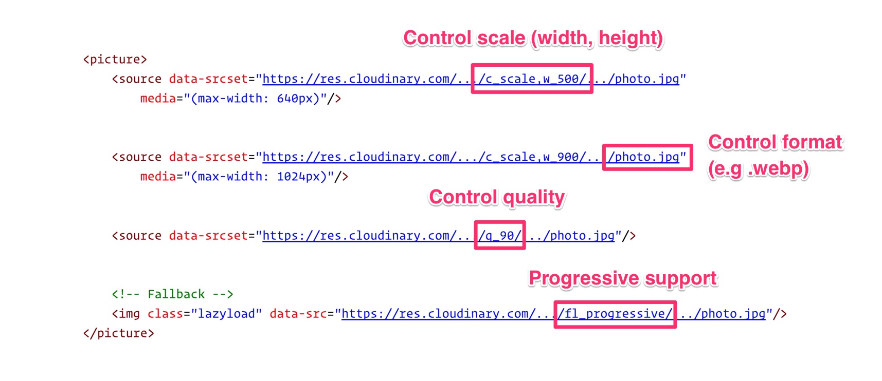
Lazysizes features include:
- Automatically detects visibility changes on current and future lazyload elements
- Includes standard responsive image support (picture and srcset)
- Adds automatic sizes calculation and alias names for media queries feature
- Can be used with hundreds of images/iframes on CSS and JS-heavy pages or web apps
- Extendable: Supports plugins
- Lightweight but mature solution
- SEO improved: Does not hide images/assets from crawlers
More Lazy Loading Options
Lazysizes is not your only option. Here are more lazy loading libraries:
- Lazy Load XT
- BLazy.js (or [Be]Lazy)
- Unveil
- yall.js (Yet Another Lazy Loader) which is ~1KB and uses Intersection Observer where supported.
What’s the catch with Lazy Loading?
- Screen readers, some search bots and any users with JavaScript disabled will not be able to view images lazy loaded with JavaScript. This is however something that we can work around with a
<noscript>fallback. - Scroll listeners, such as used for determining when to load a lazy-loaded image, can have an adverse impact on browser scrolling performance. They can cause the browser to redraw many times, slowing the process to a crawl – however, smart lazy loading libraries will use throttling to mitigate this. One possible solution is Intersection Observer, which is supported by lazysizes.
Lazy loading images is a widespread pattern for reducing bandwidth, decreasing costs, and improving user experience. Evaluate whether it makes sense for your experience. For further reading see lazy loading images and implementing Medium’s progressive loading.
Avoiding the display:none trap
Older responsive image solutions have mistaken how browsers handle image requests when setting the CSS display property. This can cause significantly more images to be requested than you might be expecting and is another reason <picture> and <img srcset> are preferred for loading responsive images.
Have you ever written a media query that sets an image to display:none at certain breakpoints?
<img src="img.jpg">
<style>
@media (max-width: 640px) {
    img {
        display: none;
    }
}
</style>
Or toggled what images are hidden using a display:none class?
<style>
.hidden {
  display: none;
}
</style>
<img src="img.jpg">
<img src=“img-hidden.jpg" class="hidden">
A quick check against the Chrome DevTools network panel will verify that images hidden using these approaches still get fetched, even when we expect them not to be. This behavior is actually correct per the embedded resources spec.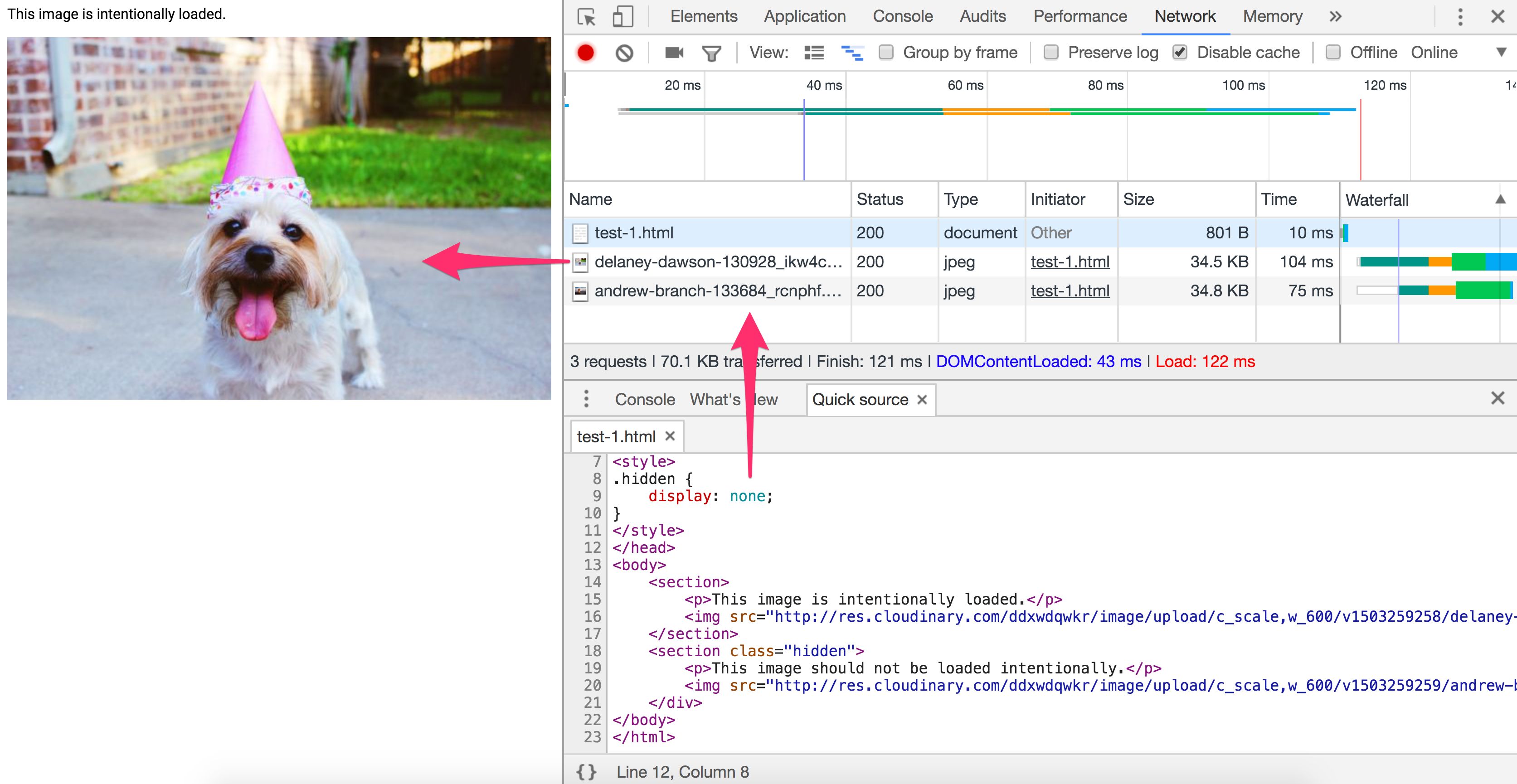
Does display:none avoid triggering a request for an image src?
<div style="display:none"><img src="img.jpg"></div>
No. The image specified will still get requested. A library cannot rely on display:none here as the image will be requested before JavaScript can alter the src.
Does display:none avoid triggering a request for a background: url()?
<div style="display:none">
  <div style="background: url(img.jpg)"></div>
</div>
Yes. CSS backgrounds aren’t fetched as soon as an element is parsed. Calculating CSS styles for children of elements with display:none would be less useful as they don’t impact rendering of the document. Background images on child elements are not calculated nor downloaded.
Jake Archibald’s Request Quest has an excellent quiz on the pitfalls of using display:none for your responsive images loading. When in doubt about how specific browser’s handle image request loading, pop open their DevTools and verify for yourself.
Again, where possible, use <picture> and <img srcset> instead of relying on display:none.
Does an image processing CDN make sense for you?
The time you’ll spend reading the blog posts to setup your own image processing pipeline and tweaking your config is often >> the fee for a service. With Cloudinary offering a free service, Imgix a free trial and Thumbor existing as an OSS alternative, there are plenty of options available to you for automation.
To achieve optimal page load times, you need to optimize your image loading. This optimization calls for a responsive image strategy and can benefit from on-server image compression, auto-picking the best format and responsive resizing. What matters is that you deliver the correctly sized image to the proper device in the proper resolution as fast as possible. Doing this is not as easy as one might think.
Using Your Server vs. a CDN
Because of the complexity and ever-evolving nature of image manipulation, we’re going to offer a quote from someone with experience in the field, then proceed with a suggestion.
"If your product is not image manipulation, then don’t do this yourself. Services like Cloudinary [or imgix, Ed.] do this much more efficiently and much better than you will, so use them. And if you’re worried about the cost, think about how much it’ll cost you in development and upkeep, as well as hosting, storage, and delivery costs." — Chris Gmyr
For the moment, we are going to agree and suggest that you consider using a CDN for your image processing needs. Two CDNs will be examined to see how they compare relative to the list of tasks we raised earlier.
Cloudinary and imgix
Cloudinary and imgix are two established image processing CDNs. They are the choice of hundreds of thousands of developers and companies worldwide, including Netflix and Red Bull. Let’s look at them in more detail.
What are the Basics?
Unless you are the owner of a network of servers like they are, their first huge advantage over rolling your own solution is that they use a distributed global network system to bring a copy of your images closer to your users. It’s also far easier for a CDN to ‘future proof’ your image loading strategy as trends change – doing this on your own requires maintenance, tracking browser support for emerging formats & following the image compression community.
Second, each service has a tiered pricing plan, with Cloudinary offering a free level and imgix pricing their standard level inexpensively, relative to their high-volume premium plan. Imgix offers a free trial with a credit towards services, so it almost amounts to the same thing as a free level.
Third, API access is provided by both services. Developers can access the CDN programmatically and automate their processing. Client libraries, framework plugins, and API documentation are also available, with some features restricted to higher paid levels.
Let’s Get to the Image Processing
For now, let’s limit our discussion to static images. Both Cloudinary and Imgix offer a range of image manipulation methods, and both support primary functions such as compression, resizing, cropping and thumbnail creation in their standard and free plans.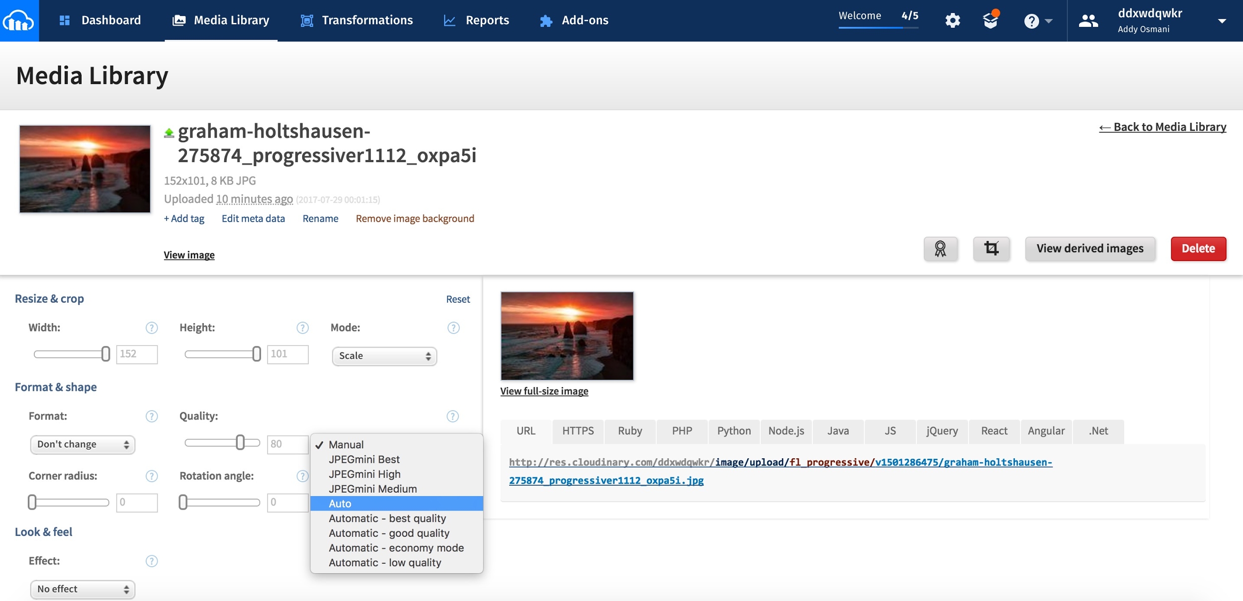
Cloudinary lists seven broad image transformation categories, with a total of 48 subcategories within them. Imgix advertises over 100 image processing operations.
What Happens by Default?
- Cloudinary performs the following optimizations by default:
- Encodes JPEGs using MozJPEG (opted against Guetzli as a default)
- Strips all associated metadata from the transformed image file (the original image is left untouched). To override this behavior and deliver a transformed image with its metadata intact, add the keep_iptc flag.
- Can generate WebP, GIF, JPEG, and JPEG-XR formats with automatic quality. To override the default adjustments, set the quality parameter in your transformation.
- Runs optimization algorithms to minimize the file size with minimal impact to visual quality when generating images in the PNG, JPEG or GIF format.
Imgix has no default optimizations such as Cloudinary has. It does have a settable default image quality. For imgix, auto parameters help you automate your baseline optimization level across your image catalog.
Currently, it has four different methods:
- Compression
- Visual enhancement
- File format conversion
- Redeye removal
Imgix supports the following image formats: JPEG, JPEG2000, PNG, GIF, Animated GIF, TIFF, BMP, ICNS, ICO, PDF, PCT, PSD, AI
Cloudinary supports the following image formats: JPEG, JPEG 2000, JPEG XR, PNG, GIF, Animated GIF, WebP, Animated WebP,BMPs, TIFF, ICOs, PDF, EPS, PSD, SVG, AI, DjVu, FLIF, TARGA.
What About Performance?
CDN delivery performance is mostly about latency and speed.
Latency always increases somewhat for completely uncached images. But once an image is cached and distributed among the network servers, the fact that a global CDN can find the shortest hop to the user, added to the byte savings of a properly-processed image, almost always mitigates latency issues when compared to poorly processed images or solitary servers trying to reach across the planet.
Both services use fast and wide CDN. This configuration reduces latency and increases download speed. Download speed affects page load time, and this is one of the most important metrics for both user experience and conversion.
So How Do They Compare?
Cloudinary has 160K customers including Netflix, eBay and Dropbox. Imgix doesn’t report how many customers it has, but it is smaller than Cloudinary. Even so, imgix’s base includes heavyweight image users such as Kickstarter, Exposure, unsplash, and Eventbrite.
There are so many uncontrolled variables in image manipulation that a head-to-head performance comparison between the two services is difficult. So much depends on how much you need to process the image — which takes a variable amount of time — and what size and resolution are required for the final output, which affects speed and download time. Cost may ultimately be the most important factor for you.
CDNs cost money. An image heavy site with a lot of traffic could cost hundreds of US dollars a month in CDN fees. There is a certain level of prerequisite knowledge and programming skill required to get the most out of these services. If you are not doing anything too fancy, you’re probably not going to have any trouble.
But if you’re not comfortable working with image processing tools or APIs, then you are looking at a bit of a learning curve. In order to accommodate the CDN server locations, you will need to change some URLs in your local links. Do the right due diligence :)
Conclusion
If you are currently serving your own images or planning to, perhaps you should give a CDN some consideration.
Caching image assets
Resources can specify a caching policy using HTTP cache headers. Specifically, Cache-Control can define who can cache responses and for how long
Most of the images you deliver to users are static assets that will not change in the future. The best caching strategy for such assets is aggressive caching.
When setting your HTTP caching headers, set Cache-Control with a max-age of a year (e.g. Cache-Control:public; max-age=31536000). This type of aggressive caching works well for most types of images, especially those that are long-lived like avatars and image headers.
Preloading critical image assets
Critical image assets can be preloaded using <link rel=preload>.
<link rel=preload> is a declarative fetch, allowing you to force the browser to make a request for a resource without blocking the document’s onload event. It enables increasing the priority of requests for resources that might otherwise not be discovered until later in the document parsing process.
Images can be preloaded by specifying an as value of image:
<link rel="preload" as="image" href="logo.jpg"/>
Image resources for <img>, <picture>, srcset and SVGs can all take advantage of this optimization.
Sites like Philips, Flipkart and Xerox use <link rel=preload> to preload their main logo assets (often used early in the document). Kayak also uses preload to ensure the hero image for their header is loaded as soon as possible.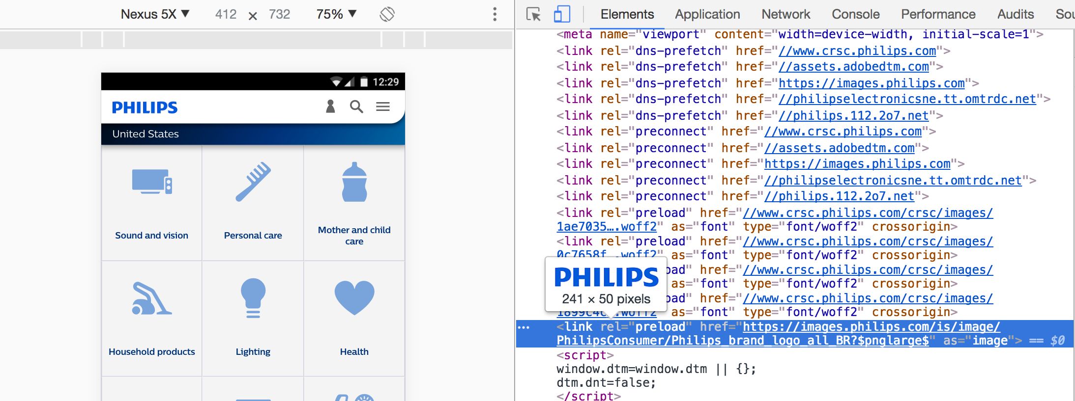
What is the Link preload header?
A preload link can be specified using either an HTML tag or an HTTP Link header. In either case, a preload link directs the browser to begin loading a resource into the memory cache, indicating that the page expects with high confidence to use the resource and doesn’t want to wait for the preload scanner or the parser to discover it.
A Link preload header for images would look similar to this:
Link: <https://example.com/logo-hires.jpg>; rel=preload; as=image
When the Financial Times introduced a Link preload header to their site, they shaved 1 second off the time it took to display their masthead image:
<link rel=preload>, Top: without. Comparison for a Moto G4 over 3G on WebPageTest both before and after.
Similarly, Wikipedia improved time-to-logo performance with the Link preload header as covered in their case study.
What caveats should be considered when using this optimization?
Be very certain that it’s worth preloading image assets as, if they aren’t critical to your user experience, there may be other content on the page worth focusing your efforts on loading earlier instead. By prioritizing image requests, you may end up pushing other resources further down the queue.
It’s important to avoid using rel=preload to preload image formats without broad browser support (e.g. WebP). It’s also good to avoid using it for responsive images defined in srcset where the retrieved source may vary based on device conditions.
To learn more about preloading, see Preload, Prefetch and Priorities in Chrome and Preload: What Is It Good For?.
Web Performance Budgets For Images
A performance budget is a ‘budget’ for web page performance that a team attempts to not exceed. For example, ‘images will not exceed 200KB on any page’ or ‘the user experience must be usable in under 3 seconds’. When a budget isn’t being met, explore why this is and how you get back on target.
Budgets provide a useful framework for discussing performance with stakeholders. When a design or business decision may impact site performance, consult the budget. They’re a reference for pushing back or rethinking the change when it can harm a site’s user experience.
I’ve found teams have the best success with performance budgets when monitoring them is automated. Rather than manually inspecting network waterfalls for budget regressions, automation can flag when the budget is crossed. Two such services that are useful for performance budget tracking are Calibre and SpeedCurve.
Once a performance budget for image sizes is defined, SpeedCurve starts monitoring and alerts you if the budget is exceeded: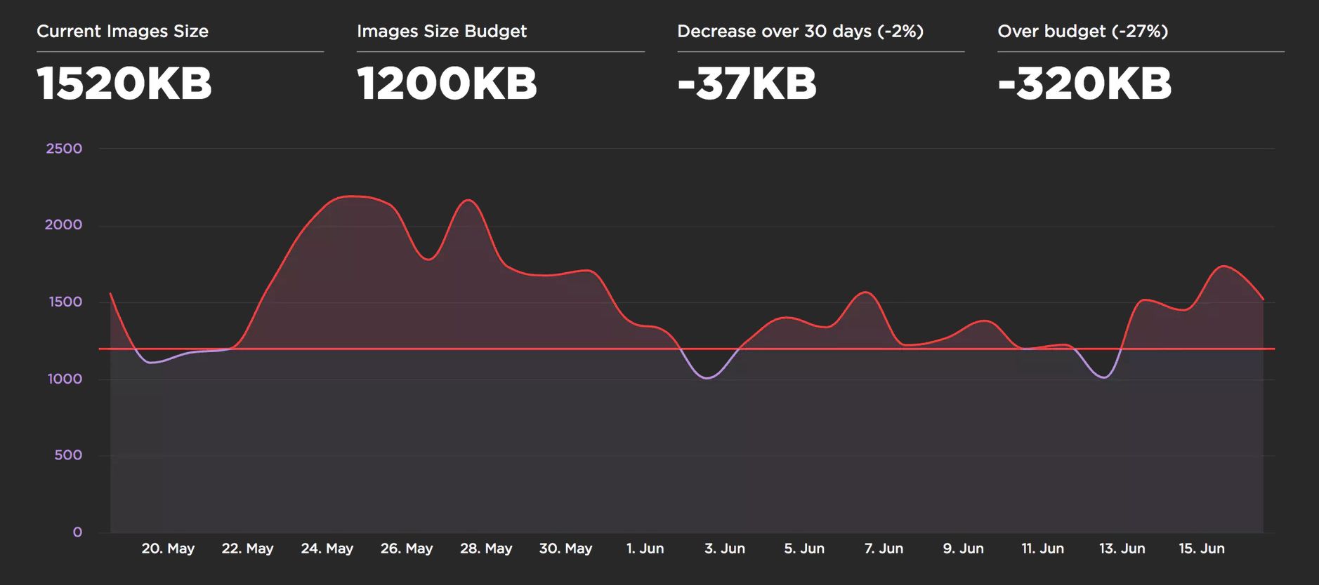
Calibre offers a similar feature with support for setting budgets for each device-class you’re targeting. This is useful as your budget for image sizes on desktop over WiFi may vary heavily to your budgets on mobile.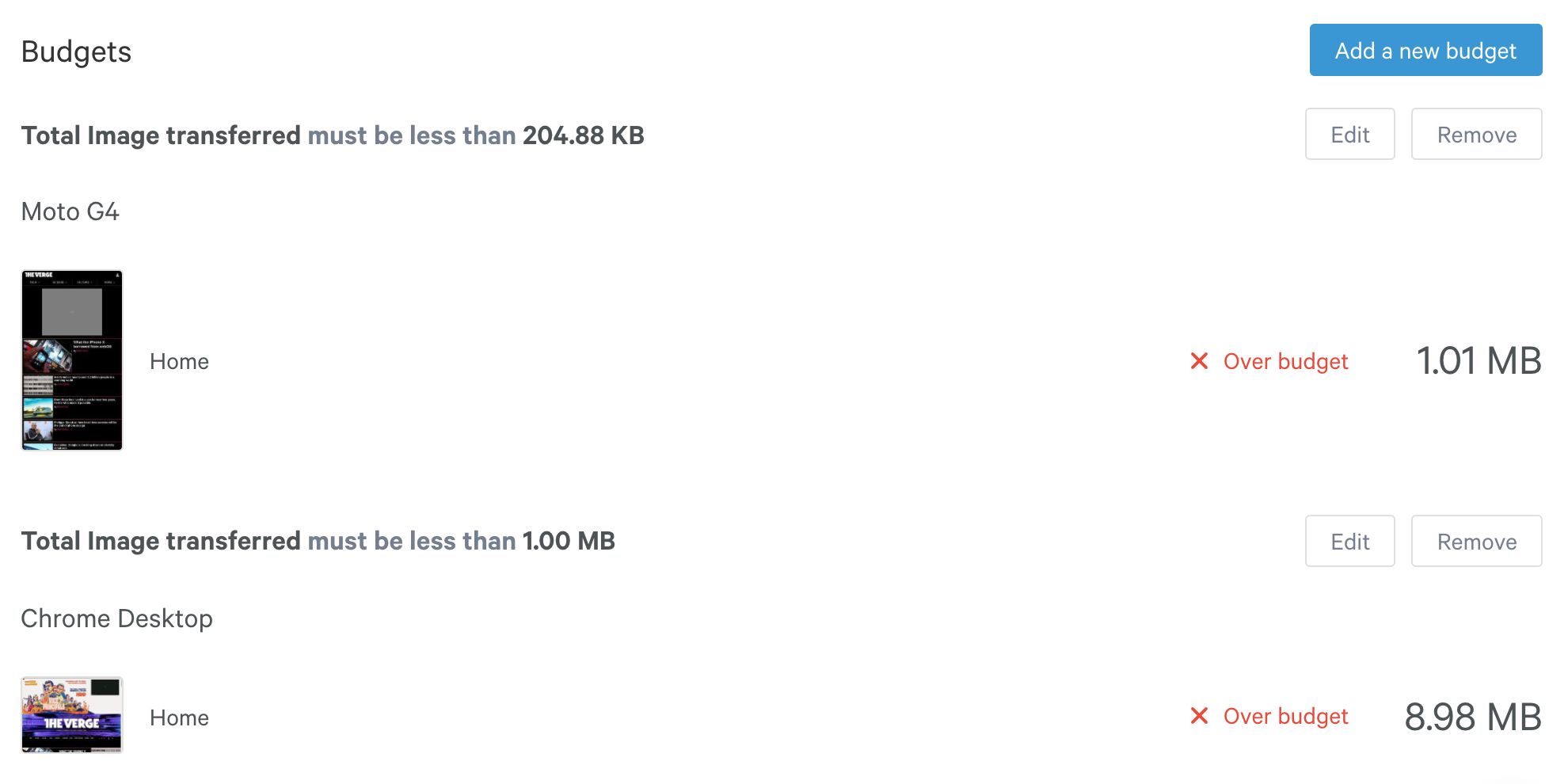
Closing recommendations
Ultimately, choosing an image optimization strategy will come down to the types of images you’re serving down to your users and what you decide is a reasonable set of evaluation criteria. It might be using SSIM or Butteraugli or, if it’s a small enough set of images, going off of human perception for what makes the most sense.
Here are my closing recommendations:
If you can’t invest in conditionally serving formats based on browser support:
- Guetzli + MozJPEG’s jpegtran are good optimizers for JPEG quality > 90.
- For the web
q=90is wastefully high. You can get away withq=80, and on 2× displays even withq=50. Since Guetzli doesn’t go that low, for the web you can MozJPEG. - Kornel Lesiński recently improved mozjpeg’s cjpeg command to add tiny sRGB profile to help Chrome display natural color on wide-gamut displays
- For the web
- PNG pngquant + advpng has a pretty good speed/compression ratio
- If you can conditionally serve (using
<picture>, the Accept header or Picturefill):- Serve WebP down to browsers that support it
- Create WebP images from original 100% quality images. Otherwise you’ll be giving browsers that do support it worse-looking images with JPEG distortions and WebP distortions! If you compress uncompressed source images using WebP it’ll have the less visible WebP distortions and can compress better too.
- The default settings the WebP team use of
-m 4 -q 75are usually good for most cases where they optimize for speed/ratio. - WebP also has a special mode for lossless (
-m 6 -q 100) which can reduce a file to its smallest size by exploring all parameter combinations. It’s an order of magnitude slower but is worth it for static assets.
- As a fallback, serve Guetzli/MozJPEG compressed sources to other browsers
- Serve WebP down to browsers that support it
Happy compressing!
Trivia
- JPEG XT defines extensions to the 1992 JPEG specification. For extensions to have pixel-perfect rendering on-top of old JPEG, the specification had to clarify the old 1992 spec and libjpeg-turbo was chosen as its reference implementation (based on popularity).
- PIK is a new image codec worth keeping an eye on. It’s compatible with JPEG, has a more efficient color-space and utilizes similar benefits found in Guetzli. It decodes at 2/3 the speed of JPEG and offers 54% more file savings than libjpeg does. It is both faster to decode and compress than Guetzli-ified JPEGs. A study on psychovisual similarity of modern image codes showed PIK was less than half the size of alternatives. Unfortunately, it’s still early days for the codec and encoding is unusably slow at this time (August, 2017).
- ImageMagick is often recommended for image optimization. This write-up considers it a fine tool, but its output generally requires more optimization and other tools can offer better output. We recommend trying libvips instead, however it is lower-level and requires more technical skill to use. ImageMagick has also histortically had noted security vulnerabilities you may want to be aware of.
- Blink (the rendering engine used by Chrome) decodes images off the main thread. Moving the decode work to the compositor thread frees-up the main thread to work on other tasks. We call this deferred decoding. With deferred decoding, the decode work remains on the critical path for presenting a frame to the display, so it can still cause animation jank. The
img.decode()API should help with the jank problem.
The content of this book is licensed under the Creative Commons Attribution-NonCommercial-NoDerivs 2.0 Generic (CC BY-NC-ND 2.0) license, and code samples are licensed under the Apache 2.0 License. Copyright Google, 2017.